1720
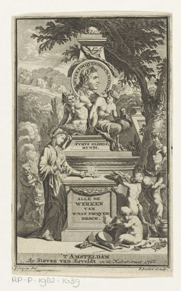
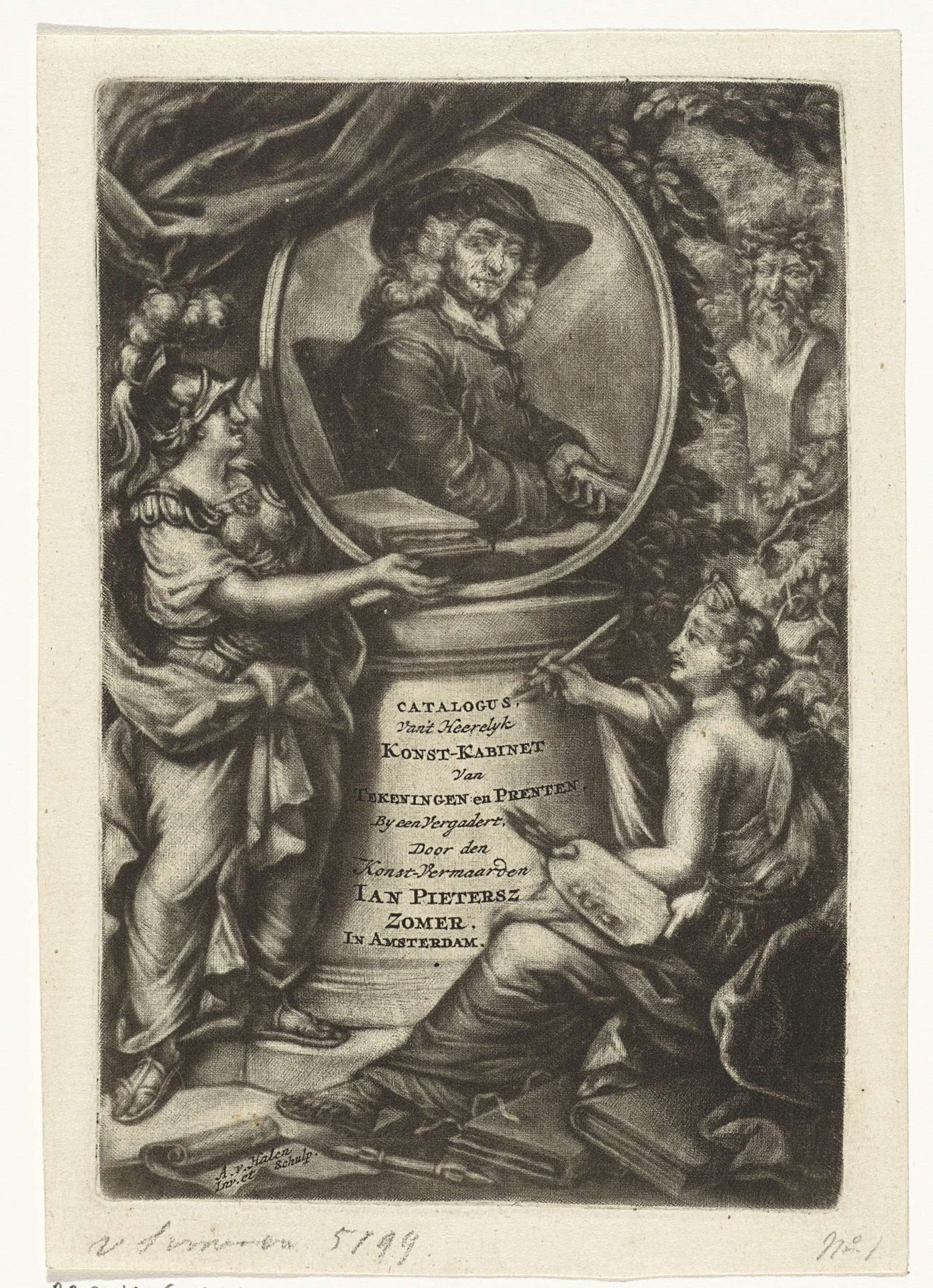
Titelpagina voor Jan Pietersz Zomers' "Catalogus van een uytstekend heerlyk cabinet van teekeningen, en schoone drukken van prenten" 1720
Listen to curator's interpretation
Curatorial notes
Editor: This is the title page for Jan Pietersz Zomers' "Catalogus van een uytstekend heerlyk cabinet van teekeningen, en schoone drukken van prenten" from 1720. It's an engraving, and the figures around the central portrait are really quite theatrical! It strikes me as incredibly elaborate for just a catalog cover. What stands out to you in this piece? Curator: You know, it's funny you say theatrical. I immediately imagine the artist, Arnoud van Halen, seeing himself as staging a grand performance, with Zomer as the leading man. What a Baroque extravaganza of self-promotion! The whole image seems to vibrate with the sheer confidence of the era, doesn’t it? Notice the two classical figures. One offering tribute while another annotates. It's pure spectacle! It practically screams, "Behold! Art!" Editor: Absolutely! But what about the portrait itself? Does it feel as… boisterous as the rest of the design? Curator: That’s the interesting counterpoint, isn't it? The portrait feels almost… grounded. Solid. Van Halen frames Zomer, yes, but it doesn't diminish his character. In fact, I wonder if that little smirk isn’t him saying, “Yes, yes, quite the show, but the art inside speaks for itself.” What do you reckon he's hiding in the books he's holding? Editor: Maybe some price estimations! So, it’s like the engraving presents two sides: flamboyant presentation versus genuine artistry? I never thought a catalog cover could have such depth. Curator: Indeed! And now I wonder if *our* interpretation does justice to this magnificent show.