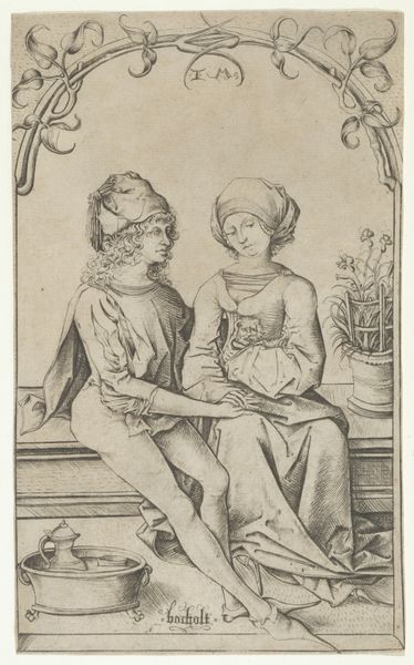
print, engraving
#
portrait
#
allegory
#
baroque
# print
#
figuration
#
line
#
genre-painting
#
engraving
Dimensions: height 218 mm, width 339 mm
Copyright: Rijks Museum: Open Domain
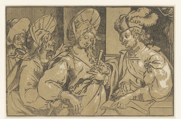
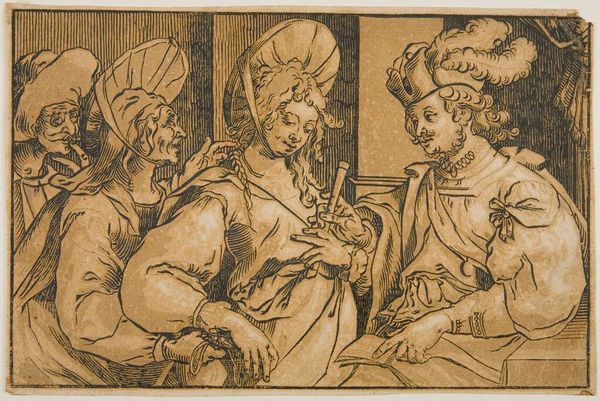
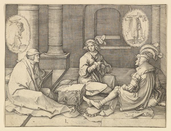
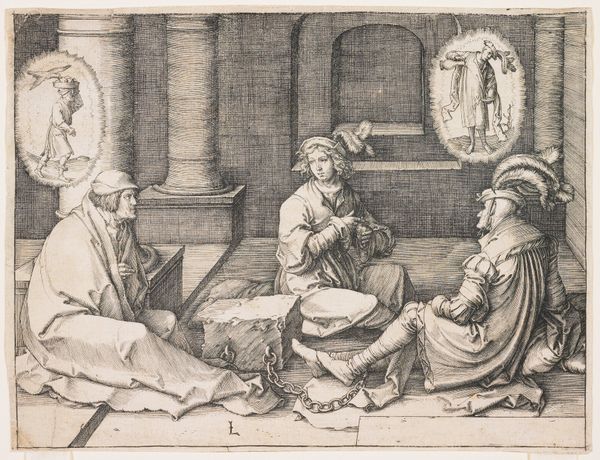
Curator: Looking at "Koppelaarster," an engraving created between 1600 and 1669 by Ludwig Büsinck, one can't help but notice its unique blend of genre and allegory, executed in a crisp, Baroque style. What strikes you first about this scene? Editor: It’s immediately the composition, isn’t it? How cramped everything feels within that shallow picture plane. And yet, the line work manages to convey such detail and, well, a certain seediness. Curator: The choice of engraving, of course, speaks to the piece's function as a print meant for wider distribution. Consider the artist's labor: meticulously carving those lines into the metal, inverting the image, proofing, editioning... the entire *process* resonates with early modern printmaking's role in spreading not only art, but also societal attitudes. Editor: Absolutely. But let's also consider how those lines define and delineate class distinctions—look at the ornate costume of the gentleman juxtaposed with the, frankly, predatory leers of the procuresses in the background. This isn't just a depiction; it’s a commentary. Notice how their garments are rendered—there is much attention devoted to how each article of clothing sits and drapes on each figure. The tonal differences help give further shape to how wealth affects visual perception, but also to how that visual difference has implications of the socio-political type. Curator: Precisely! Semiotics, as a language of exchange. Observe also the young woman’s averted gaze. The symbolic language inherent in her body language versus that of the book-holding client provides further visual reading. The way light falls—or is implied to fall—also draws our attention. What seems initially chaotic reveals careful orchestrations in its structural binaries. Editor: And while Büsinck engages these rich symbolic traditions, his choices of print production reflect the era’s changing culture, doesn't it? Cheaper prints, made widely available, provided greater freedom from patronage while simultaneously expanding art’s capitalist footprint through a wider base for consumption. The tension there is tangible. Curator: Indeed, contemplating its creation and circulation through Baroque society invites critical examination into its societal messages and their reception—this is truly an exercise in reading art within layers. Editor: Yes. Looking at this print from Ludwig Büsinck certainly reveals complexities beneath a veneer of 17th-century genre painting.
Comments
No comments
Be the first to comment and join the conversation on the ultimate creative platform.
More like this