Dimensions: height 47.8 cm, width 25.7 cm, thickness 1.3 cm, depth 9 cm
Copyright: Rijks Museum: Open Domain
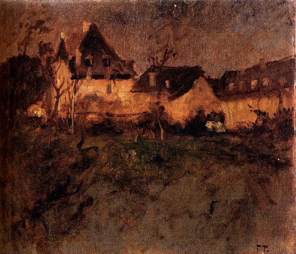
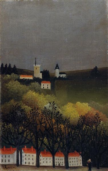
Curator: What immediately strikes me about this image is the subdued palette, almost monochromatic in places. The warm, earthy tones seem to create a nostalgic, melancholic atmosphere. Editor: Indeed, a somber mood pervades. This is “The Tower of Gorkum,” an oil painting by George Hendrik Breitner, created sometime between 1880 and 1908. It resides here at the Rijksmuseum. Breitner captures a common cityscape, but there's more than just topographic depiction at play, I think. Curator: Certainly. The tower itself acts as a cultural marker. Church towers historically served as visual anchors, representing not just religious power but civic identity, community, permanence, and the aspirations of the people. Its towering presence above the low-lying buildings evokes both protection and perhaps even the weight of tradition. Editor: From a formal perspective, I notice the interesting use of perspective and how the verticality of the tower contrasts against the horizontal spread of rooftops. The brushwork appears loose, capturing a sense of light and atmosphere, true to Impressionistic tendencies. Yet the solidity of the tower prevents the scene from becoming entirely ephemeral. Curator: That tension between ephemerality and permanence mirrors the human experience itself, doesn't it? Breitner's choice to focus on an everyday scene – rooftops, a familiar tower – allows viewers to project their own experiences and memories onto it. The symbols of home and faith, combined with his soft execution, generate a shared cultural space. Editor: There's a spatial ambiguity created by that looming tower and the indistinct middle ground. That creates a dynamic tension which reinforces this feeling of historical continuity, perhaps. This, coupled with his restricted tonal range contributes to this work’s visual impact. Curator: It makes you consider your place within a larger narrative. We are constantly interpreting visual cues to position ourselves, understanding where we stand in relation to history and our communities. Works like this capture that ongoing effort. Editor: Analyzing Breitner's approach—the structure, colors and interplay of textures and themes—deepens one’s awareness. I will be curious to seek this work out again during my next visit here.
Comments
No comments
Be the first to comment and join the conversation on the ultimate creative platform.
More like this