drawing, print, paper, photography, ink
#
portrait
#
drawing
#
aged paper
#
hand-lettering
#
ink paper printed
# print
#
hand drawn type
#
hand lettering
#
paper
#
photography
#
personal sketchbook
#
ink
#
hand-drawn typeface
#
fading type
#
sketchbook drawing
#
post-impressionism
#
sketchbook art
Copyright: Rijks Museum: Open Domain
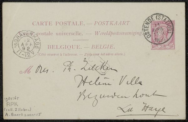
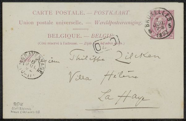
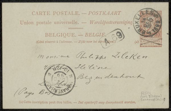
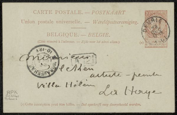
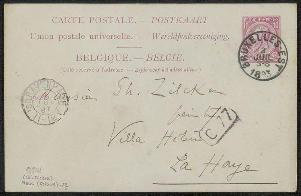
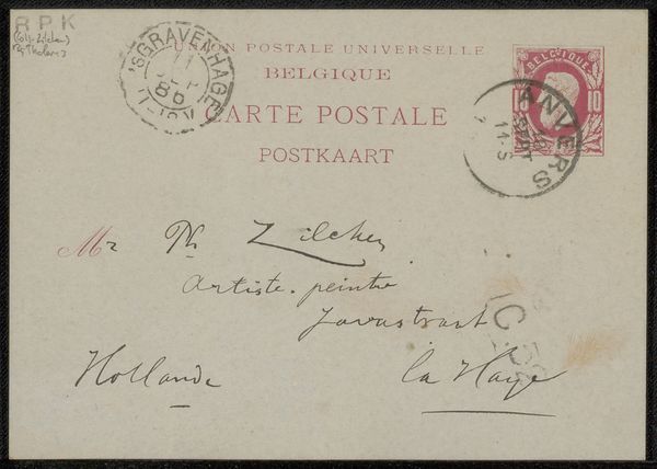
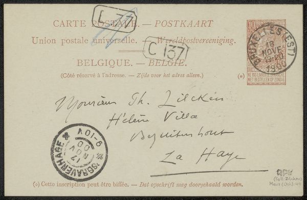
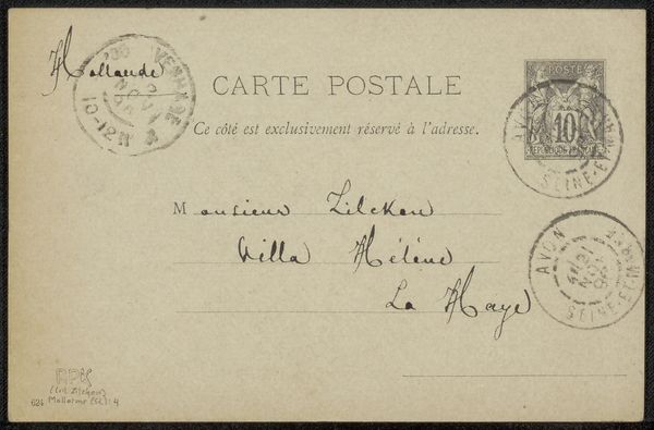
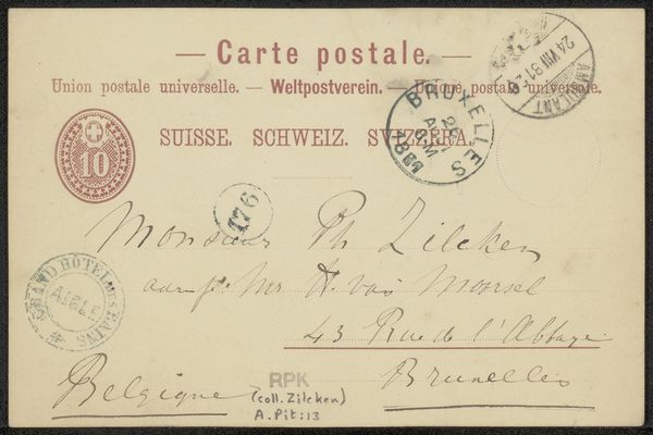
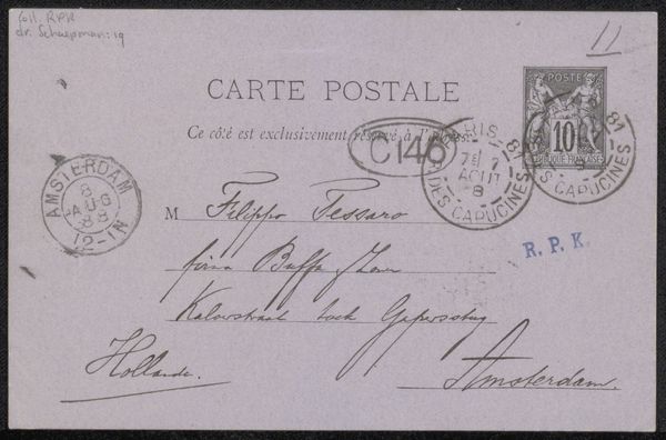
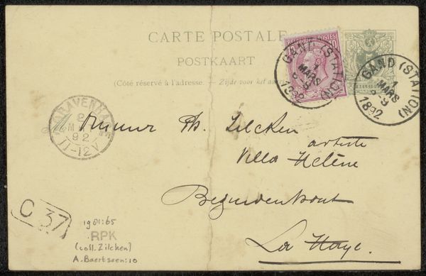
Editor: This is "Briefkaart aan Philip Zilcken," a postcard to Philip Zilcken, by Albert Baertsoen, made sometime before 1893. It looks like ink and print on paper. It’s a humble piece, really, just a simple message. But I wonder, what more can we gather from it? How do you interpret this work? Curator: Consider this humble piece, as you call it, not as a mere message but as a vessel of cultural memory. Note the fading ink, the antiquated typeface – they speak to a time when communication was a physical act, a tangible connection across distance. How does this contrast with our digital age affect your interpretation? Editor: I see what you mean! There’s definitely a sense of distance, both temporal and physical, embedded in the materiality itself. The handwriting especially gives it personality... Do the specific postal markings have significance? Curator: Absolutely. The postal stamp, "Belgique-Postes," alongside the French and Flemish text points to a Belgium straddling linguistic identities, striving for unification even in everyday correspondence. See how the simple act of mailing becomes encoded with national identity and perhaps even tension. Can we view this card as a metaphor for the act of cultural exchange? Editor: That's fascinating. I hadn't thought of it that way. So, beyond just delivering a message, it’s performing a kind of cultural ritual. The symbolism in something so simple! Curator: Precisely! It reveals the layered meanings inherent in visual symbols. Each element – the stamp, the handwriting, the printed text – contributes to a larger narrative. This ‘Briefkaart’ encapsulates a moment in time and acts as a poignant symbol of cultural identity and communication. What have you learned from looking closer? Editor: I realize how easily we overlook the cultural weight of commonplace objects. There's a richness in what seems like everyday stuff. Curator: Exactly. And that richness connects us to the past, demonstrating continuity and change. It’s amazing what can be gleaned from what seems simple at first glance!
Comments
No comments
Be the first to comment and join the conversation on the ultimate creative platform.
More like this