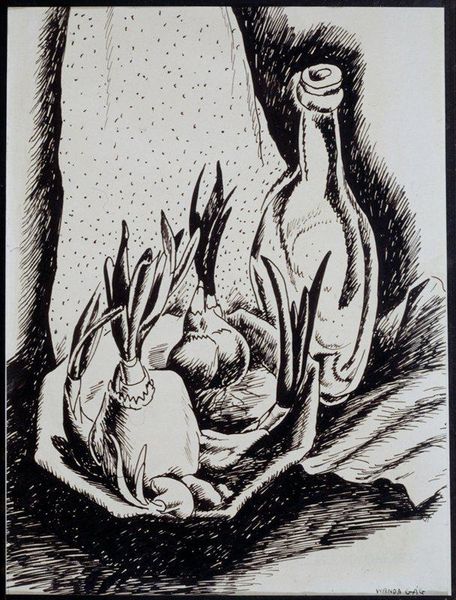
drawing, print, woodcut
#
drawing
#
organic
# print
#
figuration
#
linocut print
#
woodcut
#
line
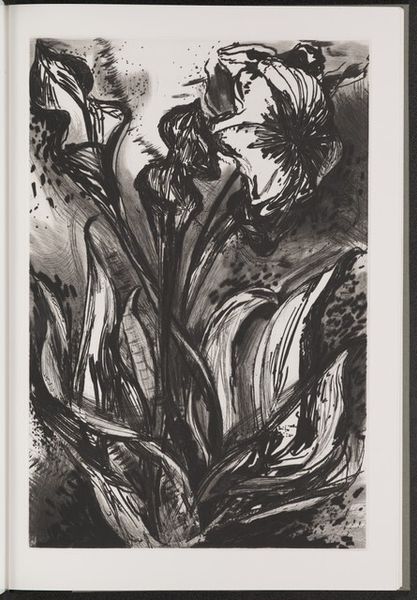
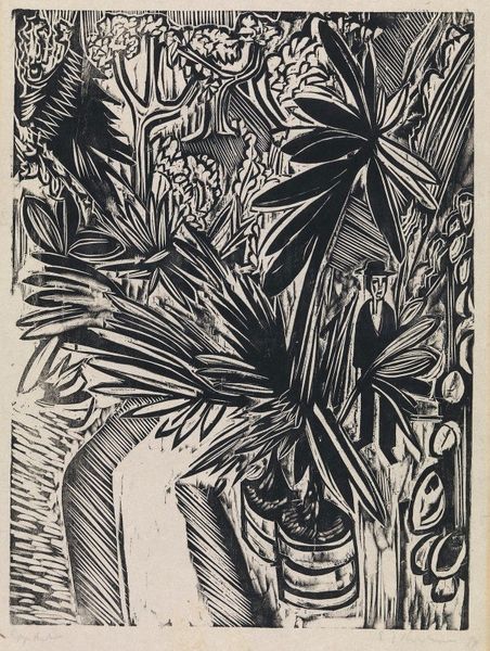
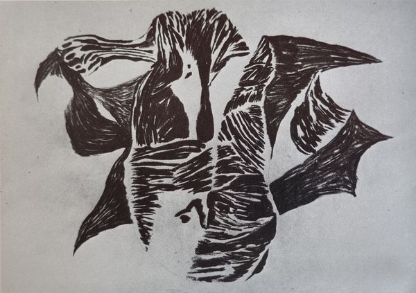
Copyright: Gregoire Boonzaier,Fair Use
Gregoire Boonzaier created this print using black ink on paper, emphasizing line and form in a way that feels both graphic and organic. It’s like he's not just depicting a hibiscus, but also the essence of growth and vitality. The stark contrast between black and white gives the image a bold, almost woodcut-like feel. Boonzaier uses lines to define the shapes of the leaves and flowers, with varying thickness that suggests depth and texture. The way the lines curve and flow reminds me of how plants reach for sunlight, always moving, always alive. Notice how the negative space around the plant is not just empty, but filled with a kind of vibrating energy. This piece reminds me of other artists who use the simplicity of black and white to capture something essential about their subjects, like some of the German Expressionists. It's a reminder that sometimes, less really is more.
Comments
No comments
Be the first to comment and join the conversation on the ultimate creative platform.
More like this