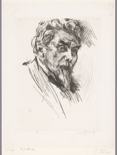
drawing, ink, pen
#
portrait
#
drawing
#
figuration
#
ink
#
pen
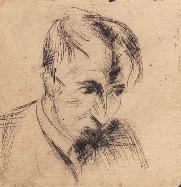
Dimensions: height 143 mm, width 132 mm
Copyright: Rijks Museum: Open Domain
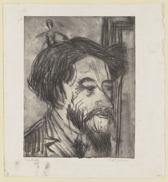
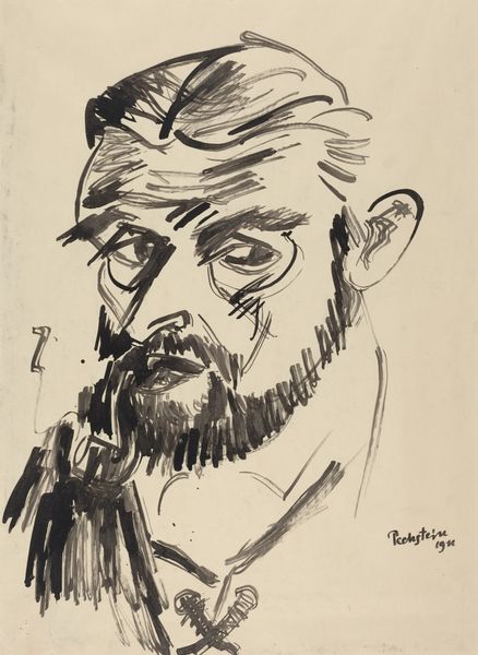
Karel Thole made this cover design for N.S. Ljeskow’s “The Immortal” in 1965 with ink on paper. I love how the dense, scratchy lines of ink create a face that feels both present and fleeting. It’s like seeing a memory, right? There’s a tension between the controlled detail in the face and the looser marks that surround it. Look at how the beard is rendered; these bold, almost haphazard strokes give the face weight and depth. The lines around the eyes – they really pull you in, don't they? It’s like Thole is showing us not just a face, but a whole inner world, too. This piece reminds me a bit of the early drawings of Picasso, where he was really stripping things down to their essence. Both artists use line to explore the emotional and psychological depths of their subjects, reminding us that art is always a conversation across time, filled with echoes and new interpretations.
Comments
No comments
Be the first to comment and join the conversation on the ultimate creative platform.
More like this