Copyright: Modern Artists: Artvee
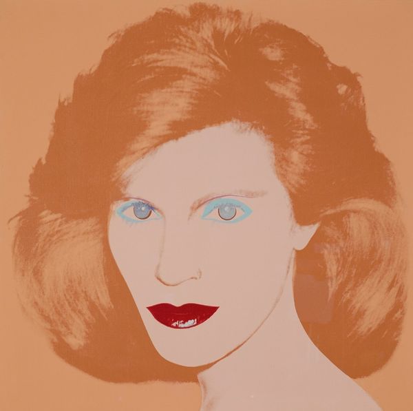
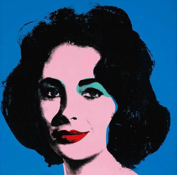
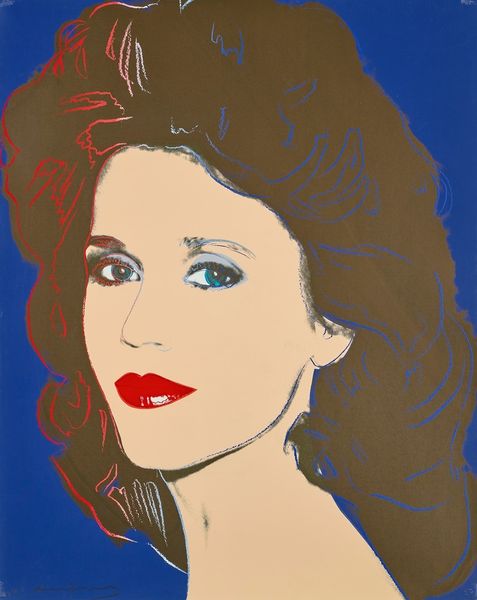
Curator: Immediately striking, wouldn't you say? It’s a portrait in acrylic paint by Andy Warhol from 1976, titled "Kay Fortson." The pop art aesthetic is undeniably present. Editor: The simplified color palette certainly makes an impression. Pale lavender, light pink, and turquoise...it feels very of its time. There's a flat quality, devoid of heavy modeling or chiaroscuro, that almost transforms her features into graphic shapes. Curator: Warhol's use of appropriation in his portraits invites us to consider celebrity, and the creation of icons in modern culture. Notice how he renders Kay Fortson's image almost as a mask. What aspects of the real person is he attempting to show? Editor: It's fascinating to observe how Warhol flattens and simplifies, yet there is this graphic distinctiveness that remains, something so specific and individual to Fortson, like the piercing blue of her eyes against the pastel color block planes, which feels surreal and manufactured. I find it disorienting. Curator: The eyes always capture our attention, don't they? Those vibrant hues may not be her real eye color, but Warhol exaggerates the color, creating this idea of the subject and celebrity becoming larger than life. Perhaps it plays with the mythology and collective memory linked to prominent social figures of the period. Editor: Absolutely. I appreciate the tension between representation and artificiality he achieves. It invites viewers to decipher the artifice, seeking the point where identity merges with symbolic construction. The minimal shadows barely suggest dimensionality, furthering the reading as surface. Curator: Right. This work is an exploration of the construction of persona itself and what it signifies to a wider audience in American culture. I think Warhol encourages us to consider the psychological weight such constructed image has. Editor: Looking again, I note how the layering of blocks forms an intriguing interplay between what feels intentional and seemingly random in color placement. I feel I understand now better why people can find that very interesting.
Comments
No comments
Be the first to comment and join the conversation on the ultimate creative platform.
More like this