graphic-art, print
#
portrait
#
graphic-art
# print
#
figuration
Copyright: Walter Battiss,Fair Use
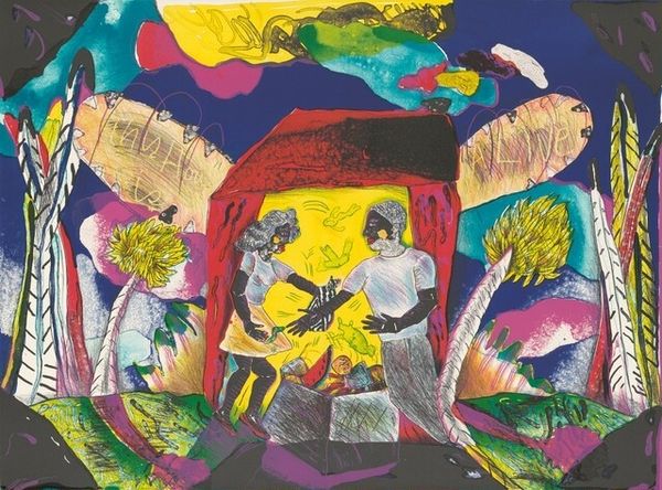
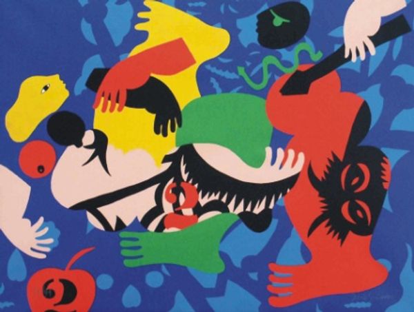
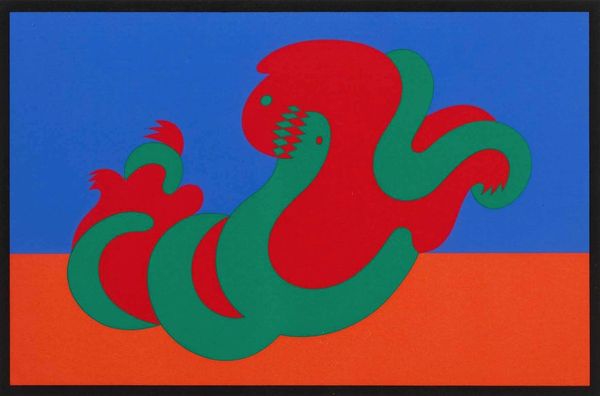
Curator: Walter Battiss's graphic print, "Girl Skipping," is certainly striking. There's a playful juxtaposition of image and text, wouldn’t you agree? Editor: Playful, yes, but initially somewhat chaotic. The collage effect, with its abrupt color fields and seemingly disparate images, feels deliberately jarring. What about its materiality grabs you first? Curator: Immediately the flatness—the resolute two-dimensionality. Battiss employs this reduction to emphasize the constructed nature of the image. Look at the bold color choices. What semiotic readings might arise? Editor: Well, the colours definitely suggest something interesting to decode. To me the raw, almost unfinished quality of the print hints at a handmade process, almost as a defiance against mass production and a celebration of traditional printmaking, no? Curator: Precisely, the texture contrasts sharply with the graphic elements; I would agree that this contrast generates an active surface, refusing the viewer a singular point of entry or, perhaps, meaning. How might this relate to Battiss’ overall oeuvre? Editor: Well, if we consider Battiss' broader artistic goals, we notice a clear departure from purely representational art. The silkscreen work, with its layers and flat blocks of color, embraces imperfection, each step of the production process contributing visibly to the final outcome, highlighting the craft. Curator: Indeed, the notion of layering becomes critical. The text "Girl Skipping Skipping Girl" seems less descriptive and more like an additional layer, disrupting a linear narrative, right? It’s a visual and textual feedback loop. Editor: So it isn’t the idealized representation of "Girl Skipping" we're experiencing but Battiss' active manipulation of materials. In so doing he shifts the emphasis from the "what" to the "how", in short highlighting production and process as the true focus. Curator: It certainly feels less like an attempt at a lifelike figuration and more of an engagement in deconstruction, offering a space where conventional form and context is subverted by visual, graphic tools. Editor: Ultimately, what's fascinating is the tactile experience implied in what feels so evidently to be silkscreen printing, highlighting the labour, time, and thought embedded in each impression. Curator: An intriguing, insightful view on process. "Girl Skipping" clearly showcases how we should not ignore the image's form when trying to identify meaning. Editor: Agreed; it certainly encourages us to rethink traditional definitions of art!
Comments
No comments
Be the first to comment and join the conversation on the ultimate creative platform.
More like this