Copyright: Public Domain: Artvee
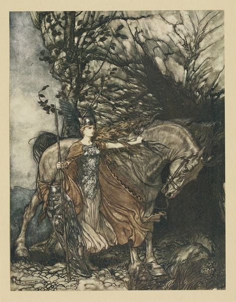
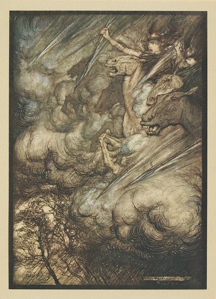
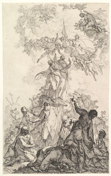
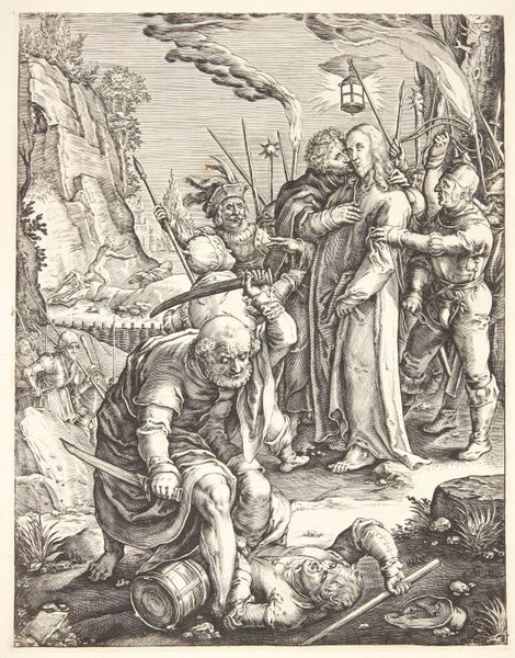
Arthur Rackham made this ink and watercolor illustration, "Spare the life of poor Loge!", and its all about the line. Look at how he builds up the forms with these delicate, scratchy lines, kind of like he's thinking out loud on paper. There's a real looseness to it, a sense of process that makes you feel like you're right there with him as he's figuring things out. Check out the way he renders the figure in the center – the one with the staff. The lines around his face are so intricate, almost like a roadmap of his emotions. The colors are muted, mostly browns and grays, but there are these little pops of color that draw you in, like the gold of the treasure. It's like he's saying, "Here's the story, but you get to fill in the blanks." Rackham reminds me of other illustrators like Aubrey Beardsley, in the sense of visual storytelling, but also someone like Kiki Smith who embraces a kind of gothic sensibility. Ultimately, it embraces a kind of ambiguity which allows for multiple interpretations over fixed meanings.
Comments
No comments
Be the first to comment and join the conversation on the ultimate creative platform.
