graphic-art, print, paper, typography
#
graphic-art
#
art-nouveau
#
paperlike
# print
#
paper
#
typography
#
hand-drawn typeface
#
clear font
#
thick font
#
white font
#
handwritten font
#
delicate typography
#
thin font
#
historical font
#
small font
Dimensions: height 211 mm, width 136 mm, thickness 13 mm
Copyright: Rijks Museum: Open Domain
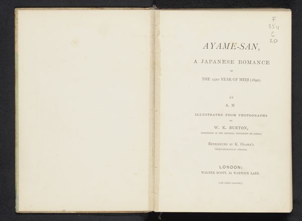
Editor: Here we have "Coup d'oeil sur Beloeil / Prince de Ligne," printed in 1908. It seems to be the title page of a book, and I’m struck by how clean and classical the typography is. What historical echoes do you pick up on when you see this page? Curator: Well, immediately I'm drawn to the phrase "Coup d'oeil." It evokes a very specific kind of knowing, doesn’t it? A glance, but one loaded with perception and insight. It suggests the Prince de Ligne wasn’t merely describing Beloeil, but offering a distillation of its essence, wouldn't you agree? Editor: I hadn't thought of it that way. So the words themselves become almost symbolic? Curator: Precisely! And the typography, although clean as you say, has Art Nouveau flourishes, suggesting a desire to present the Prince’s reflections in a modern, elegant way. It speaks to how cultural memory is filtered through the aesthetic sensibilities of a particular era. Does the layout remind you of any other books from that era? Editor: It feels formal and balanced, like a lot of turn-of-the-century design I've seen. Curator: Indeed. Think about the choice of paper, the weight of the font, and the spacing. All these elements combine to create an aura of cultivated taste and historical continuity. Even the name of the printer, Coppin-Goisse, lends the work a certain gravitas. Are we to think about a heritage of printing? Editor: I guess so! It makes me realize how much history is packed into even a single page. Curator: And how design choices can shape our understanding of that history! The surface simplicity, which at first suggested the opposite, gives way to layers of symbolic depth with a bit of careful attention. Editor: This has really changed how I'll look at typography going forward.
Comments
No comments
Be the first to comment and join the conversation on the ultimate creative platform.
More like this