print, typography
#
dutch-golden-age
# print
#
typography
#
genre-painting
#
history-painting
#
calligraphy
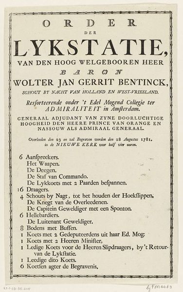
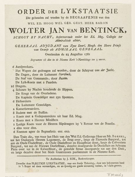
Dimensions: height 162 mm, width 200 mm
Copyright: Rijks Museum: Open Domain
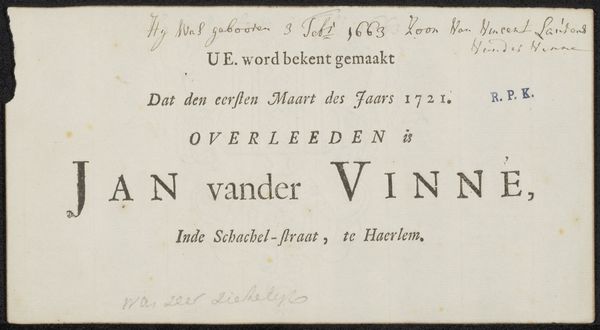
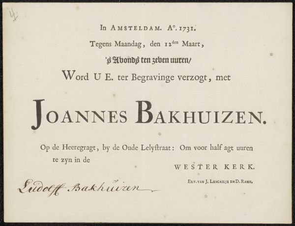
Curator: This print, dated 1781, is an invitation to the funeral of Wolter Jan Bentinck. What strikes you most about its design? Editor: Well, the stark black and white creates an immediate atmosphere of solemnity. The formality of the typography almost feels performative, like a carefully constructed stage. Curator: It's interesting you say that. Consider the historical moment – the late 18th century. The printing press enabled a wider dissemination of information, even for private events of the aristocracy. An invitation like this reflects not just personal mourning, but also public announcement of status and lineage. Wolter Jan Bentinck, Schout by Naght – essentially a naval captain – held a significant position. Editor: And "Adjudant van Zyne Doorlugtige Hoogheid?" I'm assuming that connects him with someone extremely powerful at the time. There's such an emphasis on the man's titles! But it does speak volumes about societal power structures doesn't it, and the deep interconnections between class, politics, and even death. Funerals were clearly not just somber affairs, but assertions of influence. What's it made of? Curator: Likely laid paper, given the era. And the text would've been achieved with letterpress printing. We see variations in typeface, some decorative flourishes, particularly in Bentinck's name. These stylistic choices contribute to the overall feeling of dignified restraint. Look closely, can you appreciate the labour involved in each impression? Editor: Absolutely, this piece wasn’t mass-produced in today's terms. And that makes us consider the artisan behind it and the social systems governing their lives and labour. Curator: It reveals fascinating threads of history interwoven with individual experience. It reminds us to think critically about those considered important by the elites, while obscuring contributions by laborers in its production. Editor: It certainly forces you to consider what stories get told. Thanks for the perspective.
Comments
No comments
Be the first to comment and join the conversation on the ultimate creative platform.
More like this