print, etching, engraving
# print
#
etching
#
landscape
#
line
#
engraving
#
realism
Dimensions: height 176 mm, width 258 mm
Copyright: Rijks Museum: Open Domain
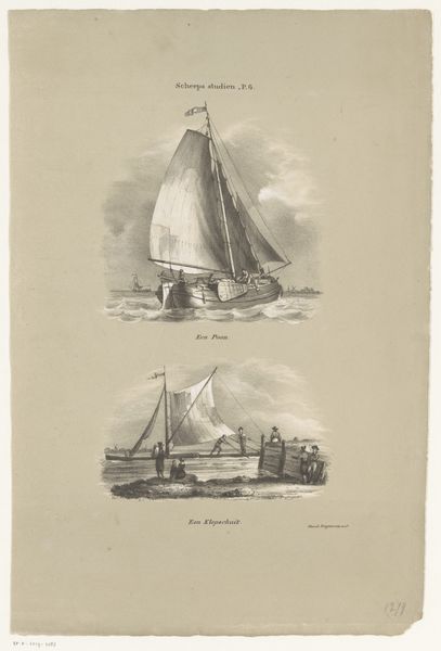
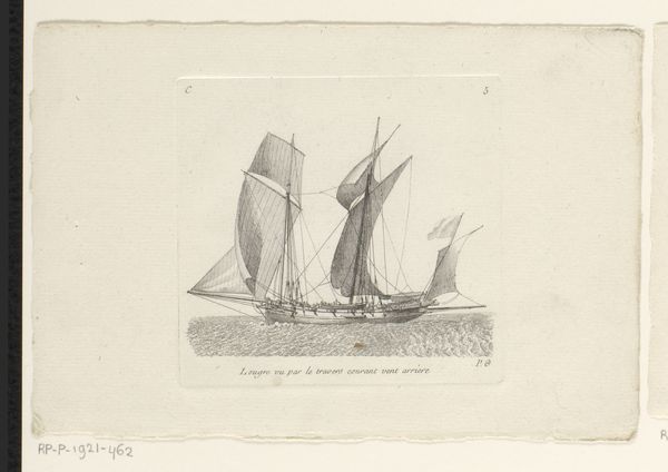
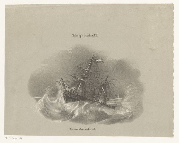
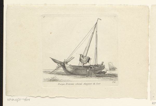
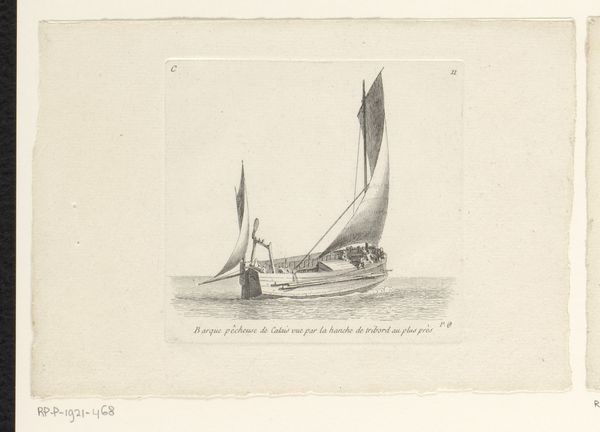
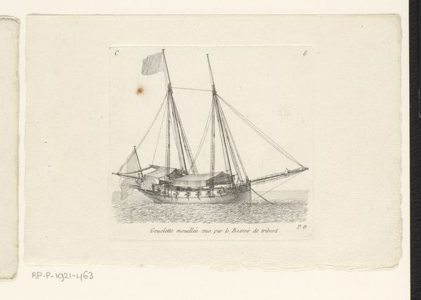
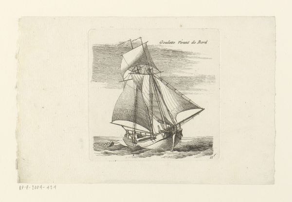
Curator: Here we have Johannes Cornelis van Pappelendam's print, "Schokker," created between 1827 and 1884. The Rijksmuseum holds this particular example of the artwork, executed using etching and engraving techniques. Editor: My first impression is of stillness within movement. The subtle shading creates a sense of serene yet powerful navigation. The clean lines composing the boat stand in harmony with the more active strokes indicating water and sky, which gives a lovely sense of texture. Curator: Indeed. This image likely depicts a Schokker boat, a type of fishing vessel common in the Netherlands. Its existence speaks volumes about the Dutch relationship with the sea, not just for industry, but a marker of cultural identity for islanders of the Schokland. Editor: Note the lines; observe the conscious variation in thickness and density. See how they meticulously shape the hull, emphasizing its sturdy construction and simultaneously illustrating the more delicate billowing of the sail. The whole visual architecture exudes confidence and mastery. Curator: From a historical point of view, one could study the representation of labor, given the figures occupying the Schokker. Their presence adds not just scale but also a narrative about the work done on these types of ships and how lives are shaped by environment and access. Editor: Precisely. Notice that despite the overall realism, the absence of overly emotive or picturesque details maintains a classical balance. Every element serves a structural purpose, drawing our gaze towards the geometric interplay and essential harmony between the boat and its setting. It's a formal study in pictorial mechanics. Curator: Which reminds me, the print being part of a series called “Scheeps studien, P.S.” points to this pedagogical purpose that it fulfilled. What aspects about boats did these prints illuminate? The distribution of visual knowledge carries its own subtle but certain influence. Editor: Overall, the engraving achieves a subtle yet confident synthesis. Its inherent minimalism reveals an artist who prioritized linear expression and controlled textural play above all else. Curator: Yes, pondering the intersection of art and maritime history here certainly broadens the dialogue beyond a singular aesthetic interpretation. Editor: Quite. The stark simplicity and intentionality allow for an active, focused viewership. The interplay between intention and reception, therefore, provides room for many types of appreciation.
Comments
No comments
Be the first to comment and join the conversation on the ultimate creative platform.
More like this