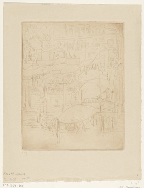
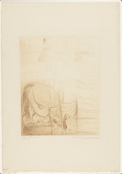
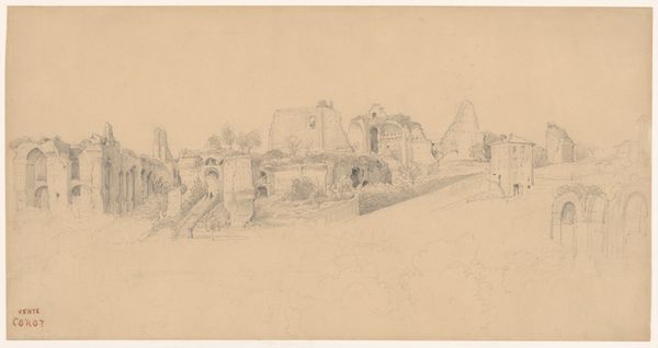
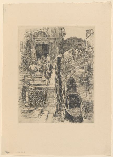
Badende en biddende mannen en vrouwen aan de oever van de Ganges in Benares 1917
0:00
0:00
drawing, print, etching, pencil
#
drawing
# print
#
etching
#
pencil sketch
#
asian-art
#
landscape
#
river
#
etching
#
pencil
#
cityscape
#
watercolor
Dimensions: height 248 mm, width 198 mm
Copyright: Rijks Museum: Open Domain
Editor: This etching by Wijnand Otto Jan Nieuwenkamp, titled "Bathing and Praying Men and Women on the Banks of the Ganges in Benares," from 1917, feels incredibly intricate despite its almost monochromatic palette. There’s a certain depth created by the layering of figures and architectural forms. What compositional choices strike you the most when you look at this piece? Curator: The work distinguishes itself through its formal arrangement. Note the interplay of linear elements; the vertical strokes suggest a teeming population while the geometric shapes above establish the architecture as an intrinsic element of both control and frame. What do you see in the treatment of light? Editor: I observe that there is no obvious, bold indication of it. Perhaps the artist is hinting at the intense light using layered line work, which in turn is almost suggestive of haze rather than pinpointed areas of light. Curator: Precisely. Observe how the artist has rendered tonal variation and texture predominantly using hatching. It is neither stark nor overtly shadowed. Do you agree the effect contributes to the overall delicate, ethereal quality of the print, whilst simultaneously hinting at the energy and density of life on the banks of the Ganges? Editor: Yes, it is all working in harmony, achieving both a peaceful, serene quality, while hinting at chaos by representing what one can only expect is a populated scene. The linear and planar components support the subject matter rather elegantly. It definitely underscores how fundamental form is. I now see this is not merely documentation; the formal composition evokes atmosphere. Curator: Indeed. Consider how effectively Nieuwenkamp used relatively simple marks to convey complex spatial relationships and textures. This approach heightens the visual intrigue considerably, would you agree? Editor: I certainly do. It highlights how an artist's formal decisions fundamentally shape our perception and emotional connection to their work. Thank you for highlighting that; it really shifts the reading of the image for me.
Comments
No comments
Be the first to comment and join the conversation on the ultimate creative platform.
More like this