1695
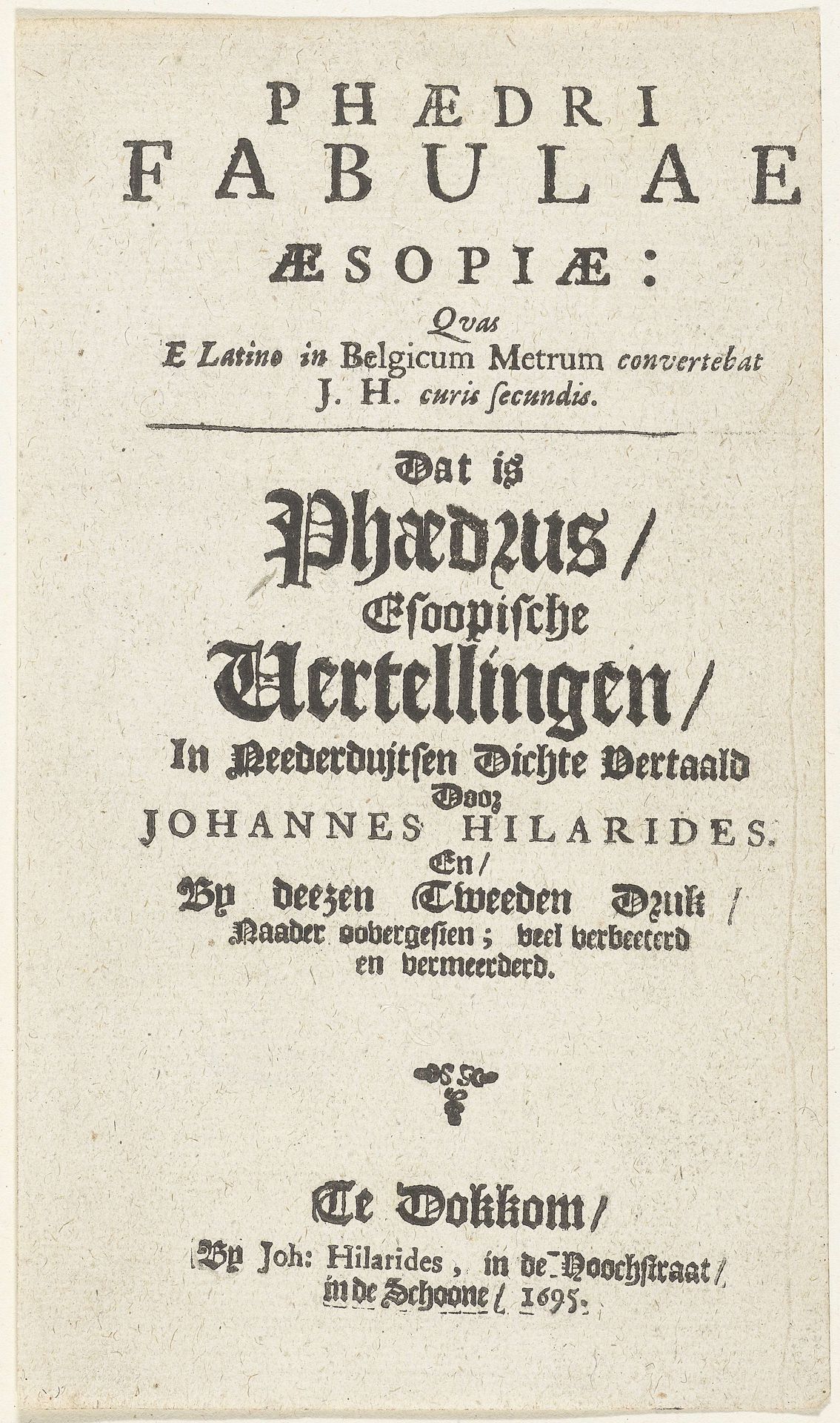
Titelpagina voor: J. Hilarides, Fabulae Æsopiæ, 1695
Listen to curator's interpretation
Curatorial notes
Editor: This is the title page for *Fabulae Æsopiæ* by Johannes Hilarides, dated 1695. It's a print, so black ink on paper, mostly typography. The varied fonts give it such a strong textural quality. What compositional elements stand out to you? Curator: The hierarchy is intriguing. Notice how the initial words, “Phædri Fabulae Æsopiæ,” employ a clean, Roman typeface. It's a clear, authoritative declaration of classical origin. Below that, the text transitions into these wonderfully elaborate, almost aggressively gothic letterforms, announcing the translation and the translator’s additions. This interplay between classical and vernacular typefaces serves a distinct purpose. Wouldn't you agree? Editor: I do. It is setting up a dialectic! The contrast emphasizes both the tradition of Aesop and the modernity of this specific publication. Is there more to say about how these two distinct halves interact visually? Curator: Observe the placement and size. The classical portion is given prominence through larger, well-spaced letters at the top, lending gravitas. Yet, the lower section, denser and more ornate, draws our eye downwards, anchoring the composition and declaring the agency of Hilarides. Consider how the eye navigates the page— from clarity to complexity, from the universal to the particular. The shift also indicates how taste evolved at the turn of the 18th century in Europe. Editor: I never considered how typefaces could signal such cultural shifts! Thank you! Curator: Likewise, a focused analysis on compositional structure is often very revealing.