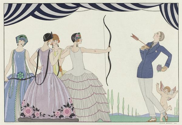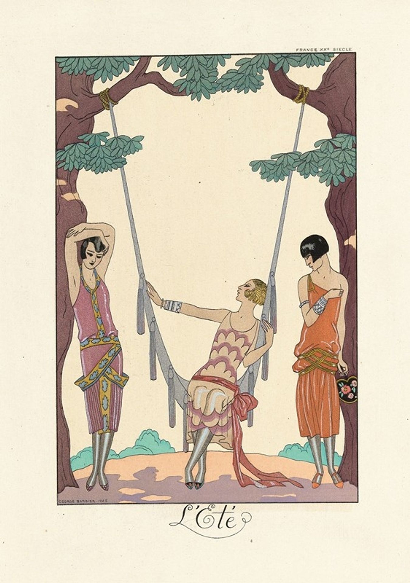
About this artwork
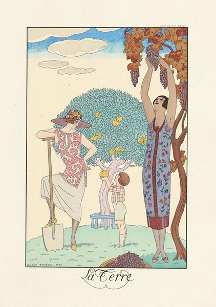
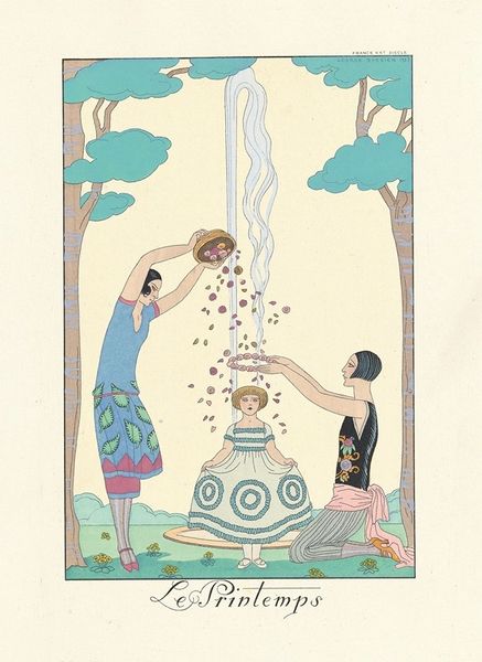
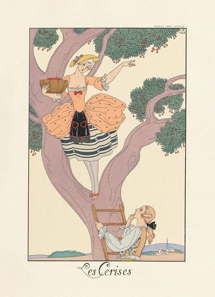
George Barbier made this fashion plate, L’Été, sometime in the 1920s with watercolor and ink on paper, and right away, I notice the way he uses thin, washy colors to evoke a sense of summer. It's interesting how the light touch of the watercolors gives everything a kind of breezy, effortless feel, like sketching in a notebook by the beach. Looking closely, you can see where the colors bleed softly into each other, creating subtle gradients and shadows that give depth to the figures and the landscape. The color palette leans towards pastels – soft pinks, oranges, and greens – that evoke a feeling of warmth and leisure. I'm drawn to the way Barbier uses the ink lines to define shapes and add a sense of graphic clarity to the composition. It reminds me a little of Erté, with his focus on elegant, elongated figures and intricate patterns. But there's something uniquely Barbier about the way he combines the delicate watercolor washes with the crisp ink lines, creating a balance between spontaneity and control. In art, like life, there are no fixed or definitive meanings.
Artwork details
- Medium
- drawing, print
- Copyright
- Public Domain: Artvee
Tags
portrait
art-deco
drawing
pastel soft colours
traditional media
figuration
flat colour
illustrative and welcoming imagery
genre-painting
Comments
Be the first to share your thoughts about this work.
About this artwork
George Barbier made this fashion plate, L’Été, sometime in the 1920s with watercolor and ink on paper, and right away, I notice the way he uses thin, washy colors to evoke a sense of summer. It's interesting how the light touch of the watercolors gives everything a kind of breezy, effortless feel, like sketching in a notebook by the beach. Looking closely, you can see where the colors bleed softly into each other, creating subtle gradients and shadows that give depth to the figures and the landscape. The color palette leans towards pastels – soft pinks, oranges, and greens – that evoke a feeling of warmth and leisure. I'm drawn to the way Barbier uses the ink lines to define shapes and add a sense of graphic clarity to the composition. It reminds me a little of Erté, with his focus on elegant, elongated figures and intricate patterns. But there's something uniquely Barbier about the way he combines the delicate watercolor washes with the crisp ink lines, creating a balance between spontaneity and control. In art, like life, there are no fixed or definitive meanings.
Comments
Be the first to share your thoughts about this work.