print, typography
#
portrait
#
aged paper
#
paperlike
# print
#
sketch book
#
hand drawn type
#
personal sketchbook
#
typography
#
journal
#
fading type
#
stylized text
#
thick font
#
history-painting
#
handwritten font
Dimensions: height 220 mm, width 140 mm, thickness 35 mm
Copyright: Rijks Museum: Open Domain
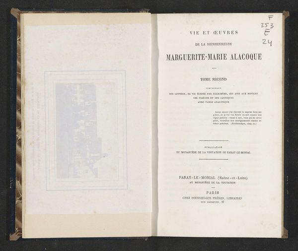
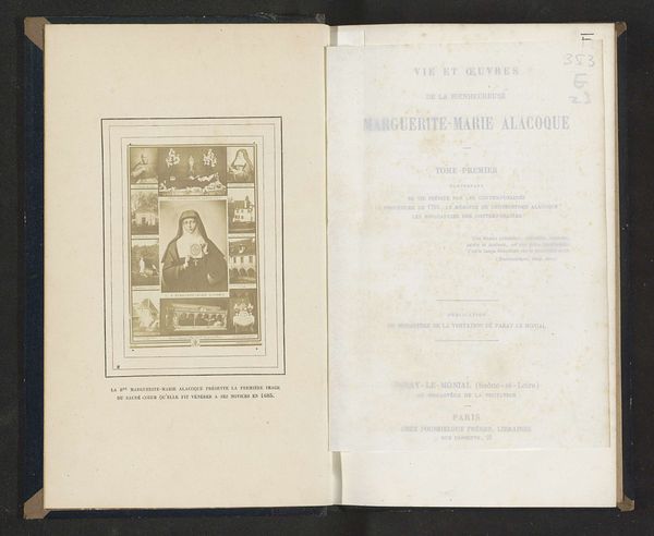
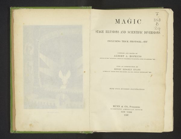
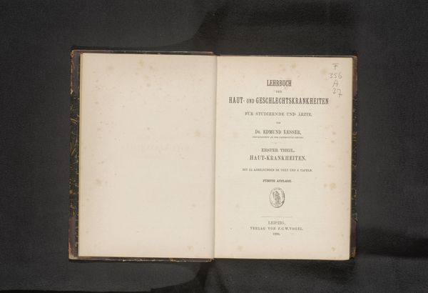
Curator: Here we have "Vie et oeuvres de la bienheureuse Marguerite-Marie Alacoque…", printed in 1867 by Poussielgue Frères. The book presents a life and works of the Blessed Marguerite-Marie Alacoque. Editor: It looks like it has seen better days. I am drawn to the graphic design itself. The symmetrical arrangement of the text on the right page contrasts rather dramatically with the illustration on the left. It really does strike one immediately. Curator: Indeed. We must consider the social and material circumstances of its creation. This book, a mass-produced print, made knowledge accessible in a rapidly changing world. Poussielgue Frères, as publishers, were playing a vital role in disseminating information and shaping public discourse. The means of production were evolving, creating new forms of accessibility and cultural influence. Editor: That is an interesting view. But it seems to me the typography really holds our gaze. The serifs and varied font sizes denote a clear visual hierarchy that directs our understanding, not unlike classical painting composition. Note, also, the texture of the aged paper: this is not merely a surface but an active aesthetic participant adding warmth. Curator: I'd agree about warmth. It has clearly served a practical, devotional purpose, likely passed from hand to hand over decades. I imagine the labour involved: the compositors setting the type, the printers operating the presses. The very act of reading would have been a tactile experience tied to labor and class. It reflects changing devotional trends amongst average citizens in nineteenth-century France, in other words. Editor: The stylistic unity achieved here, despite the book’s age, showcases the enduring design principles. A successful print achieves visual harmony and textual legibility to draw readers. Even now. Curator: Its survival through generations makes it a cultural artifact as well as just text on a page. And what about the intended readership—a religious order producing books for itself and others? Its circulation provides valuable insights into religious life and gendered roles within the Church at that time. Editor: Yes. And considered structurally, the print also captures and communicates spiritual ideals through very simple, yet elegant formal elements. The very symmetry is, one could argue, representative of the desire for a balanced and harmonious existence. Curator: Exactly! What strikes you, finally? Editor: Its timeless elegance; even in decay, beauty prevails. Curator: Agreed, a simple printed volume resonates far beyond its modest materials and the circumstances of its production.
Comments
No comments
Be the first to comment and join the conversation on the ultimate creative platform.
More like this