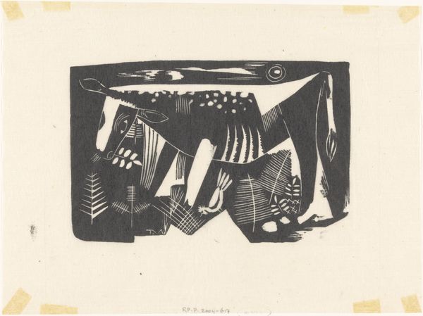
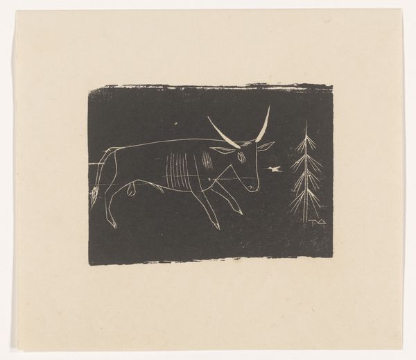
print, linocut, woodcut
# print
#
linocut
#
woodcut effect
#
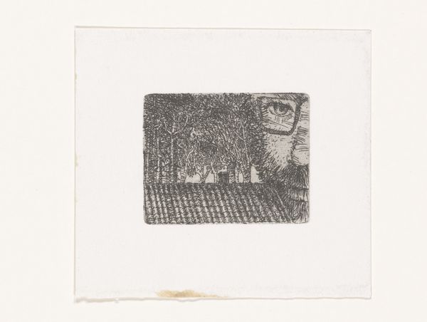
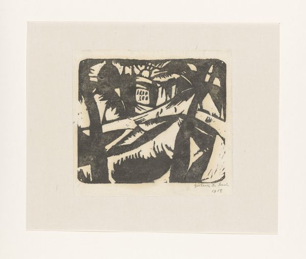
landscape
#
figuration
#
linocut print
#
woodcut
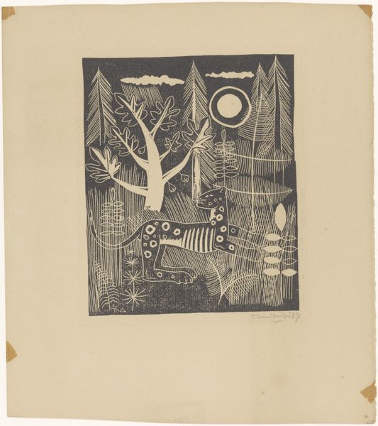
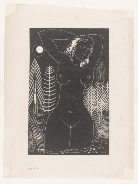
Dimensions: height 119 mm, width 148 mm, height 218 mm, width 253 mm
Copyright: Rijks Museum: Open Domain
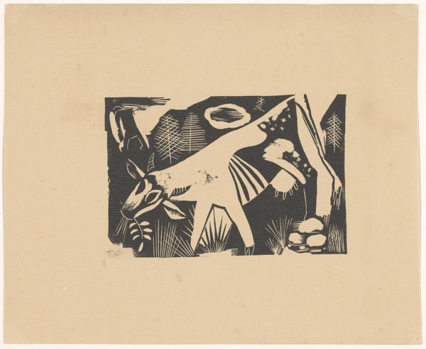
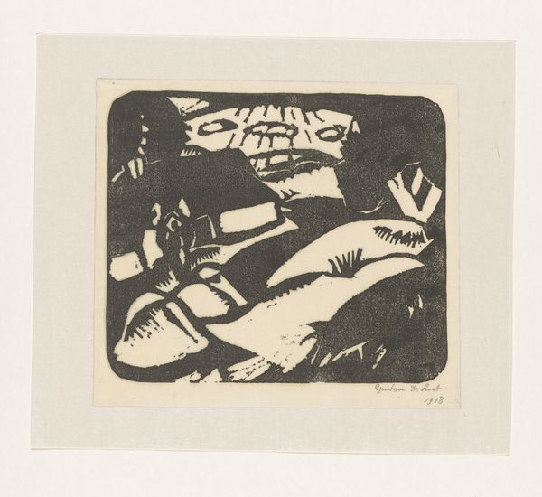
Curator: Look at this striking linocut print, “Jeroen op jacht,” or “Jeroen on the Hunt,” created by Tinus van Doorn in 1937. What’s your first reaction? Editor: The stark contrast between black and white creates a sort of primal drama, doesn’t it? There's a simplicity to the forms, a kind of intentional reduction, which really grabs you. It’s quite effective! Curator: Van Doorn was clearly interested in the inherent qualities of the linocut medium itself. Think about the physical act of carving into the linoleum block, the labor involved, and how that translates into the final image. Notice the woodcut effect of the marks left behind. This aesthetic choice bridges what some may call high art and craft. Editor: Precisely! The composition directs the eye immediately towards the stylized cat in the foreground. Consider how the vertical lines of the foliage contrast with the round moon, framing the animal and emphasizing its enigmatic gaze. Curator: Let’s consider this image in the broader context of printmaking in the Netherlands during the 1930s. Woodcuts and linocuts were relatively accessible and democratic mediums, weren’t they? This made them popular vehicles for artists interested in representing everyday life. Editor: You're right. Moreover, the flat, graphic nature emphasizes symbolic interpretation, inviting questions about the hunter, the hunted, the role of nature, and even the societal relationships they can be correlated with. Curator: By investigating the linocut process and its materials, we begin to see Van Doorn as not just an artist, but as a craftsman deeply engaged with the means of production of art. This print exemplifies an accessible medium through which artists can explore, communicate, and also address society at large. Editor: And analyzing form brings us closer to Van Doorn’s perspective. We become attuned to his vision, one where stark contrast embodies visual impact, allowing us to appreciate its composition and to probe into his intentions through artistic language and execution. Curator: Seeing the artist's approach, technique, and place of print within the social structure provides an opening of the conversation for the here and now. Editor: Indeed. Through visual deconstruction, we have successfully appreciated the graphic and meaningful simplicity.
Comments
No comments
Be the first to comment and join the conversation on the ultimate creative platform.
More like this