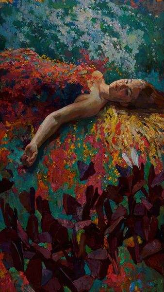
acrylic-paint
#
portrait
#
abstract expressionism
#
pop art
#
acrylic-paint
#
figuration
#
pop-art
#
portrait art
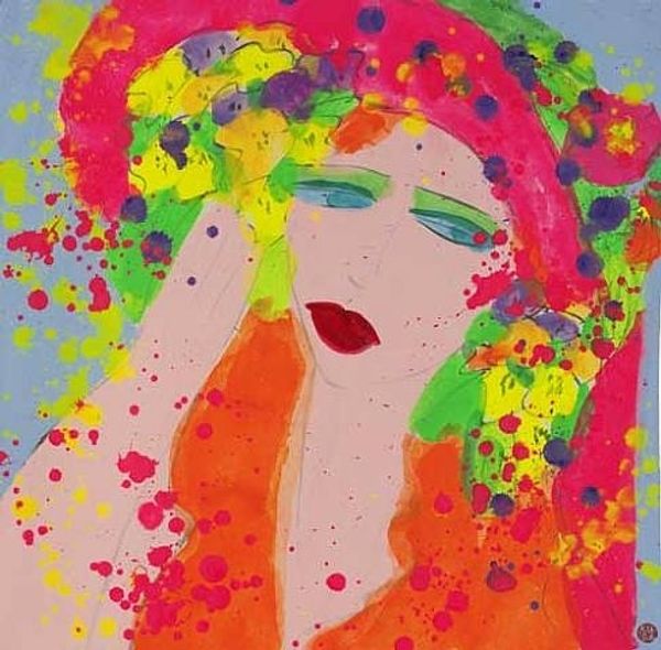
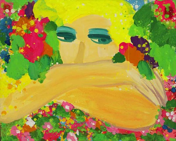
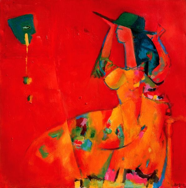
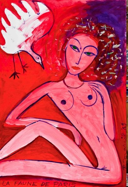
Copyright: Walasse Ting,Fair Use
Curator: Let's take a moment to consider "I See You" by Walasse Ting, an acrylic on canvas which showcases the artist’s distinctive pop art sensibility. Editor: Well, my initial reaction is... vibrant! The saturated yellow backdrop practically pulsates. It feels energetic, almost aggressively cheerful, doesn't it? Curator: Indeed. Ting's use of high-key color is characteristic of his oeuvre. What I find compelling here is how the flatness of the picture plane, typical of Pop Art, coexists with the energetic drips and splatters, adding a dimension of spontaneous gesture. It complicates any straightforward reading. Editor: Complicates it in a fun way! It's as though he's acknowledging both the commercial aspect of the genre, its ties to advertisement, and the artist's subjective intervention. Pop art with, dare I say, personality. How do we position Ting historically? Curator: Ting was working internationally during a time of enormous cultural exchange, living and working across continents, notably within the context of the CoBrA group’s legacy, where experimentation was so prized. One has to look at the artist's life in-between cultures to understand it, I feel. There’s a negotiation in these pictures between traditions, histories and styles. The application of his medium adds interest as well; the splatters and pools create tension, contrasting with flatly-applied blocks of color. Editor: Yes, and consider the gaze – "I See You." Who is seeing whom? The female subject, or the viewer? Is she passive, presented for our consumption, or is there something subtly challenging about her directness? It really encourages a dynamic between artwork and audience, the political power of an image, in essence. Curator: It’s a clever question of power and its gaze, and you could delve further into feminist readings in connection to this topic. Her exaggerated, flattened features almost recall mask-like qualities, bringing to mind the complexities of representation itself. Is this truly a "portrait" in the traditional sense, or is it something far more coded? Editor: Precisely! I find myself looking past its obvious stylistic appeals, past its genre association, and into the politics of image-making itself, making the canvas feel almost unsettling at times, given the vibrant background and heavy use of bright red colour. A rather unique intersectionality comes through. Curator: Indeed. Thinking more on its composition, and Ting's strategic balance between accident and intention is remarkable. His bold strokes carry such rhythm and verve! Thank you, this has provided a deeper understanding and different angles to consider, always useful. Editor: A vibrant consideration, indeed. Thanks to you, too! It is interesting to note how historical interpretation can offer so many various considerations of form and meaning.
Comments
No comments
Be the first to comment and join the conversation on the ultimate creative platform.
More like this