watercolor
#
abstract
#
watercolor
#
expressionism
#
abstraction
#
watercolor
Copyright: Public Domain: Artvee
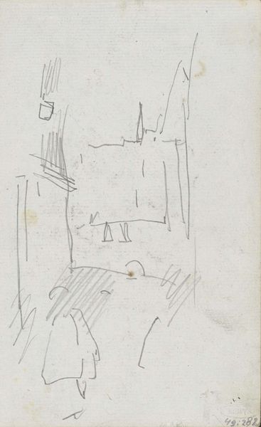
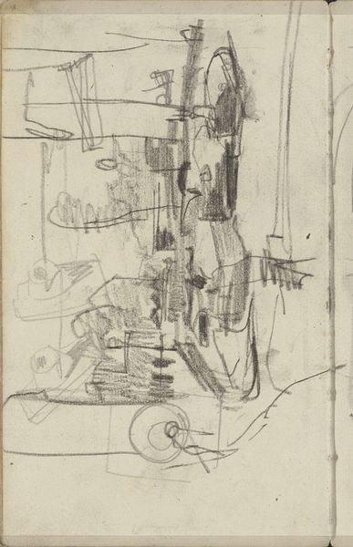
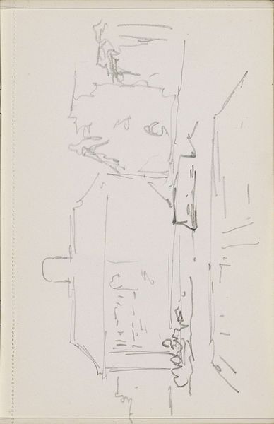
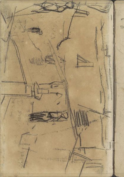
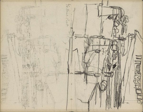
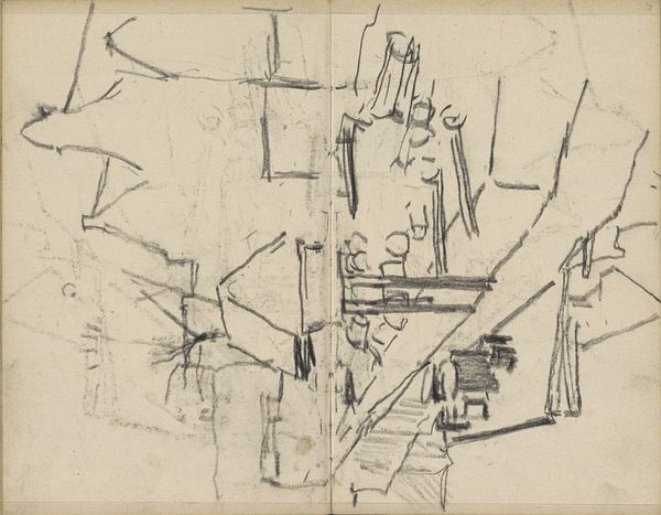
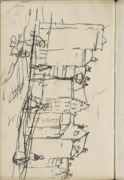
Paul Klee made 'Before the Festivity' with these gentle, muted colors, like a faded memory. The shapes feel built up, bit by bit, almost like he's feeling his way through the composition. The surface has this dry, chalky texture, and the colors are laid down in these thin, transparent washes, allowing the underlayers to peek through. See how the black lines scratch across the surface, defining shapes and adding a sense of depth? I think Klee's not trying to hide his process; it’s all out there on the canvas, every layer and correction. Look at how the lines seem to wobble and dance, giving the whole composition a kind of off-kilter energy. He reminds me a bit of Miro, another artist who wasn't afraid to let his imagination run wild. Both embrace ambiguity, inviting us to bring our own interpretations to the table.
Comments
No comments
Be the first to comment and join the conversation on the ultimate creative platform.
