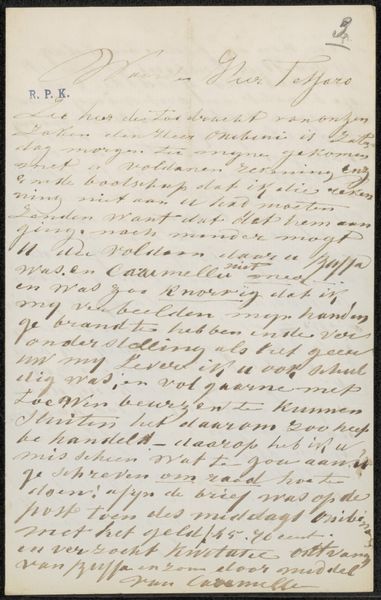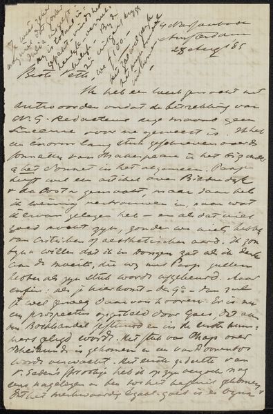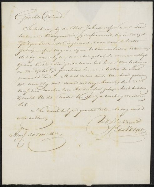
Possibly 1851 - 1854
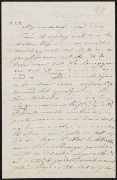
Brief aan Jan Weissenbruch
Listen to curator's interpretation
Curatorial notes
Curator: Here, we have “Brief aan Jan Weissenbruch,” or “Letter to Jan Weissenbruch,” a work possibly dating from 1851 to 1854 by Carl Friedrich Lӧbbecke. It’s a drawing executed in ink on paper, exhibiting a striking use of calligraphy. What strikes you most immediately about this piece? Editor: There’s a rhythm, isn't there? The script swirls and dips like a musical score, creating an overall texture that feels almost more important than the words themselves. It gives the impression of someone pouring out their thoughts with real urgency. Curator: That’s perceptive. The formal elegance of calligraphy transforms what would otherwise be a simple note into a work with tangible artistry. Look at the carefully weighted strokes; the ascenders and descenders are so elaborate. Editor: And see how that flourishes even becomes an artwork border! But is it legible? Because beyond the look, I'm wondering if it successfully conveys meaning or if we get lost in the beauty of the line. Curator: Absolutely. The text itself, although in Dutch and historically styled, alludes to art matters. It seems to contain arrangements for picture panels and offers notes, probably for other artwork commissions or collection updates, given his acquaintance with painter Jan Weissenbruch. Editor: It speaks to me of a private exchange, a moment frozen in time between artists, captured in these swirls of ink. To think that such a seemingly fleeting object was considered worth saving… Curator: Exactly. It provides an intimate glimpse into the artistic milieu of the time. Preserved documents of ephemera like these become more valued the further we get from them. Editor: In our digital age, this kind of analog beauty really hits you. The imperfections, the smudges – it makes the writer seem so real. Curator: A testament to Lӧbbecke's skill in rendering beauty through utility. What seems on the surface just an average letter becomes almost precious. Editor: Yes, something penned to facilitate commerce is so much more, and really moves us beyond those pragmatic first intentions into something worthy of posterity.