Copyright: Rijks Museum: Open Domain
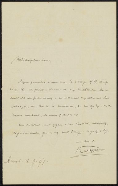
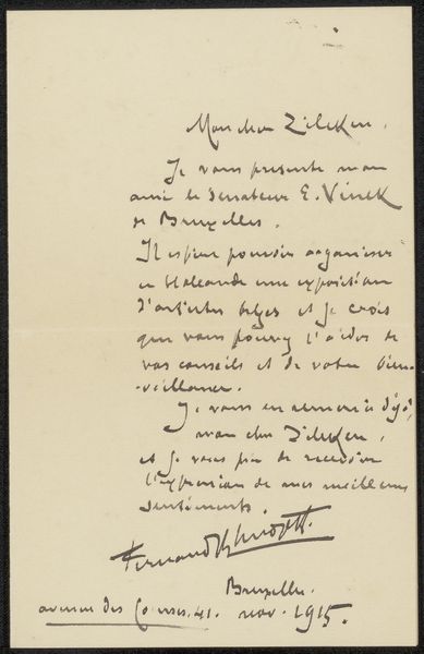
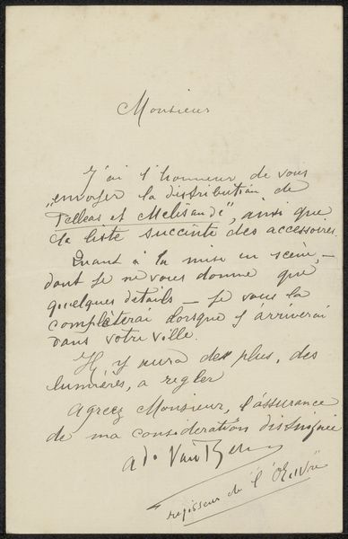
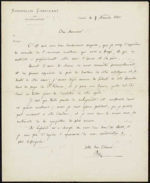
Editor: This is "Brief aan Pieter Haverkorn van Rijsewijk" by Henri-Gabriel Ibels, created before 1897. It’s ink on paper, and currently residing in the Rijksmuseum. I'm struck by how the printed letterhead contrasts with the handwritten text beneath it, especially the elegant calligraphic style. It has such a personal feel. What catches your eye in this work? Curator: I am immediately drawn to the interplay between the printed and the hand-written elements. Notice how the crisp typography of the restaurant letterhead at the top establishes a formal structure, a sort of grid. But then observe how that is undermined and humanized by the fluid, almost frantic cursive of the letter itself. Editor: That contrast really amplifies the personal message, doesn't it? Curator: Precisely. Look at the varying weight of the ink lines. There is a clear consciousness in the way Ibels manipulates the pressure of his pen to create depth and rhythm on the page. And consider the relationship between the black ink and the negative space of the paper. Where do you think the artist’s expressive priorities lie here? In textual representation, or in pictorial expression? Editor: Pictorial expression, definitely. The letter feels less about its explicit content and more about the visual texture, the dance of lines and spaces. It almost feels like a purely abstract composition at times. Curator: A discerning observation. I think it underscores how the materiality of the ink, its physical presence on the page, becomes paramount, arguably eclipsing the letter's communicative function. We're left contemplating not just the words, but their very substance and arrangement. Editor: It's fascinating to see how a simple letter can become such a visually rich experience. I will look for the interplay of intention and material when considering other works as well.
Comments
No comments
Be the first to comment and join the conversation on the ultimate creative platform.
More like this