Dimensions: height 352 mm, width 700 mm
Copyright: Rijks Museum: Open Domain
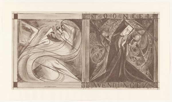
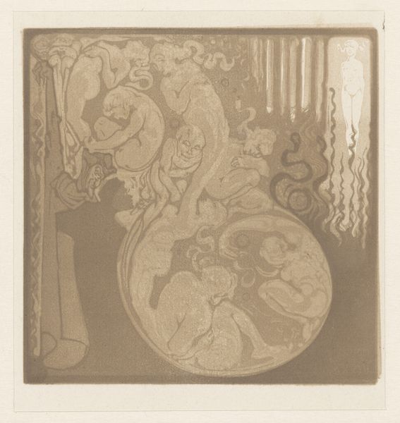
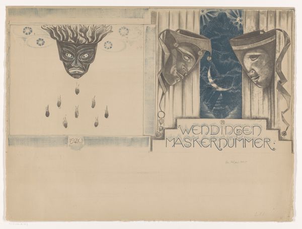
This cover design for ‘Wendingen’ magazine was created by Richard Nicolaüs Roland Holst in 1928. It's a lithograph that has this incredible, graphic quality, all achieved in shades of grey. You can almost feel the artist working through the image, building it up layer by layer. Holst contrasts two distinct styles and atmospheres on either side of the page. On the left, a framed scene shows a seated figure surrounded by dense, stylized foliage. It is a real gem within the composition. Then on the right, a more turbulent space unfolds with swirling lines, organic shapes, and typography. It feels like Holst is playing with different modes of representation, from the figurative to the more abstract and decorative. This reminds me of the graphic work of someone like Emil Cardinaux, in that it combines Art Nouveau with a modernist sensibility. It's that kind of tension that makes this image so compelling. I love to see artists experimenting with form, embracing the messiness, and leaving space for our imaginations to wander.
Comments
No comments
Be the first to comment and join the conversation on the ultimate creative platform.
More like this