drawing
#
photo of handprinted image
#
drawing
#
amateur sketch
#
water colours
#
rough brush stroke
#
incomplete sketchy
#
possibly oil pastel
#
fading type
#
underpainting
#
watercolour bleed
#
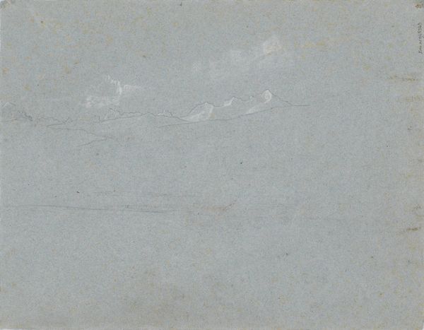
watercolor
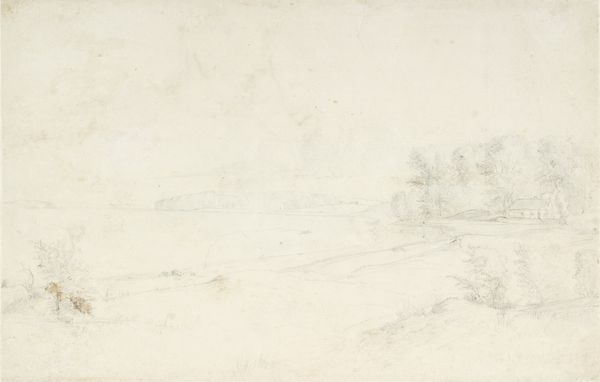
Dimensions: 169 mm (height) x 211 mm (width) (bladmaal)
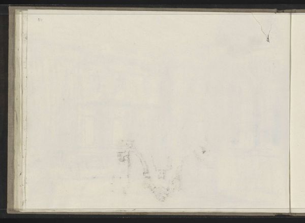
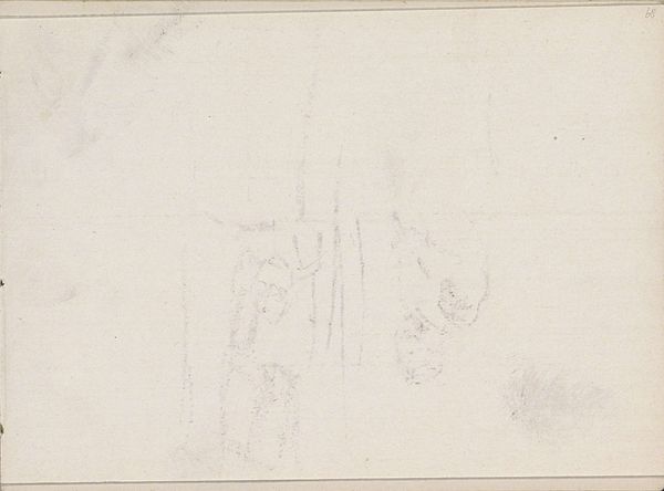
Curator: This piece is titled "Rids af kirketårn," which translates to "Sketch of a Church Tower." It’s attributed to Dankvart Dreyer and believed to have been created sometime between 1816 and 1852. What's striking about it to you? Editor: My initial feeling is one of melancholy and ephemerality. It’s as if a memory is barely clinging to the paper. The tower seems more like a ghost than a solid structure, doesn't it? Curator: Absolutely. The ethereal quality is largely due to Dreyer's technique. He's using primarily watercolor in very dilute washes, which creates a sense of lightness. For me, the tower can also represent safety in the village and connection with the beyond. I feel that. Editor: Yes, there's an intriguing tension between the church tower as a potential source of strength or control. Perhaps there is an opposition going on in the landscape, or also Dreyer suggests more openness to other forces and voices, given how lightly he depicts it. I think for any marginalized groups in the village, for women in particular, a place of spiritual or bodily imprisonment comes to mind instead. What's going on culturally for that tower to come into being in the 19th century? What message is given to the local community about religion or submission? I don't find "safety," but threat. Curator: It’s fascinating how you interpret that icon, as potentially negative or as a social mechanism rather than purely spiritual guidepost. Perhaps in Dreyer's own mind there was less a notion of cultural constraint and control, but there is ambiguity there in these washes. One could view his composition almost as if he’s washing those more entrenched, rigid symbols and power dynamics, away. Editor: Exactly. That tension makes this deceptively simple sketch quite powerful, wouldn’t you agree? The artist’s touch reveals something unsettling about these very commonplace social arrangements, that seem to offer safety on the surface. Curator: I find myself considering what’s missing as much as what’s there. It's almost an invitation to overlay our own understanding and history onto the image. Editor: I agree, it is evocative and invites viewers to bring our own history. Ultimately, perhaps it suggests that icons and landscapes hold many possible meanings, shaped by how one lives in and moves through a space, rather than conveying any one absolute idea.
Comments
No comments
Be the first to comment and join the conversation on the ultimate creative platform.
More like this