drawing, ink, pen
#
drawing
#
script typography
#
hand-lettering
#
old engraving style
#
hand drawn type
#
hand lettering
#
personal sketchbook
#
ink
#
hand-drawn typeface
#
intimism
#
pen work
#
sketchbook drawing
#
pen
#
small lettering
Copyright: Rijks Museum: Open Domain
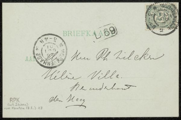
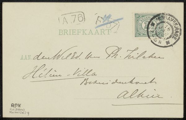
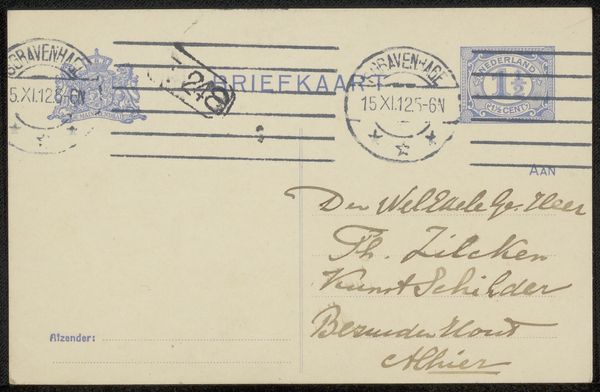
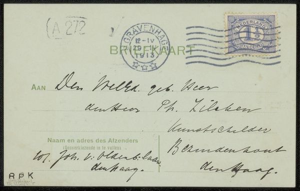
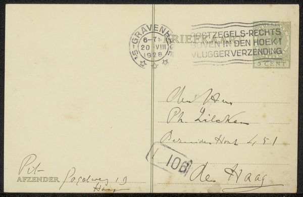
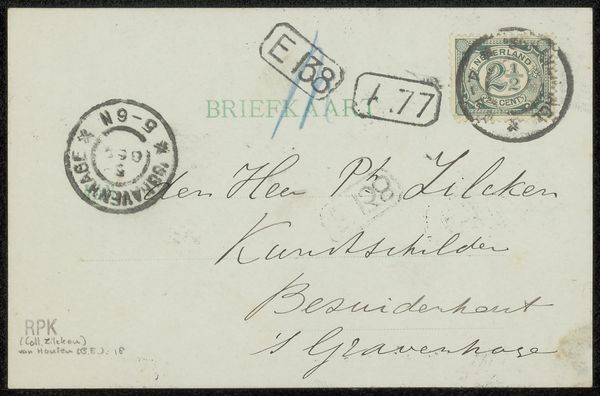
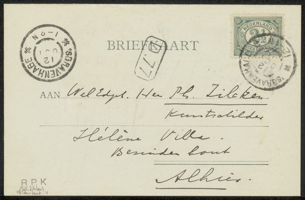
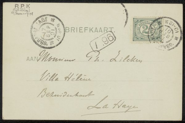
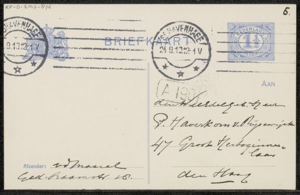
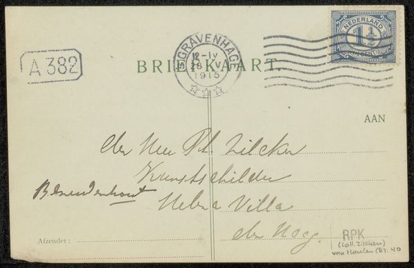
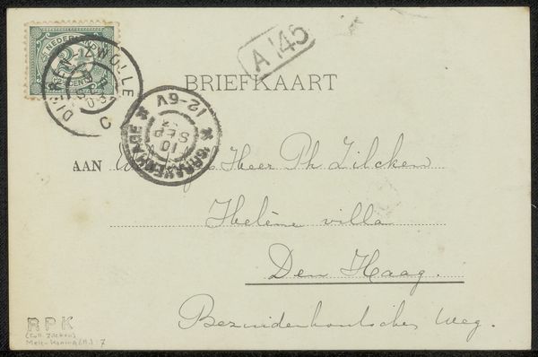
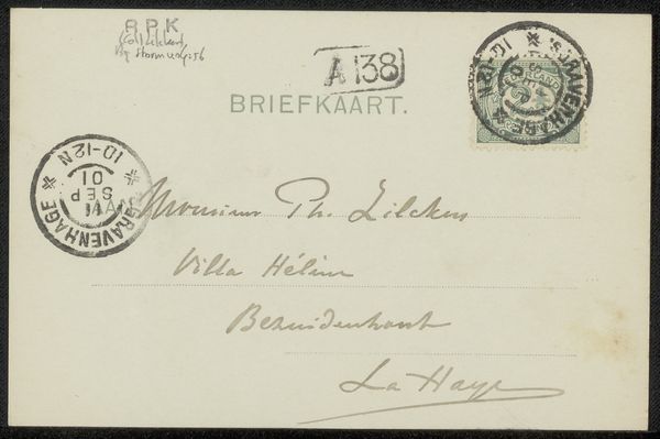
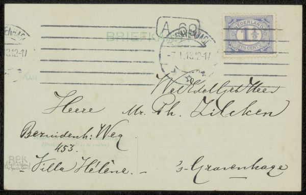
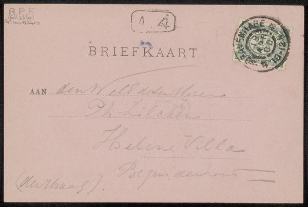
Editor: Here we have Barbara Elisabeth van Houten’s "Briefkaart aan Philip Zilcken," made with pen and ink sometime before 1912. The hand-lettering is really striking and nostalgic to me, so what are your initial thoughts when you see this piece? Curator: What stands out immediately are the marks of transit, the postal stamps, and how they intersect with the personal script. Each postal mark is a symbolic assertion of time, place, and purpose; their convergence hints at cultural continuity and a network that binds individuals. Editor: So you see those marks as representing cultural connection? Curator: Precisely! Think about what the act of sending a letter meant then – anticipation, tangible connection across distance. How does the visual language used by Van Houten, the way she arranges the words on the card, connect with those sentiments for you? Does it evoke the same intimacy, or does it bring to mind something different? Editor: I do get a sense of intimacy, definitely. The handwriting feels very personal, almost like a glimpse into the artist's mind. It’s interesting how such a commonplace object could carry so much emotional weight. Curator: Exactly. The everyday, the quotidian act of correspondence is elevated through Van Houten’s care and attention. It becomes an artifact laden with layers of meaning, connecting sender, receiver, and ultimately, us. Editor: It makes me appreciate how much intention and thought went into simple communications. Thanks for illuminating the hidden depths. Curator: My pleasure. It reminds us to look beyond the surface of even the simplest things, and consider the emotional and cultural memory that they carry.
Comments
No comments
Be the first to comment and join the conversation on the ultimate creative platform.
More like this