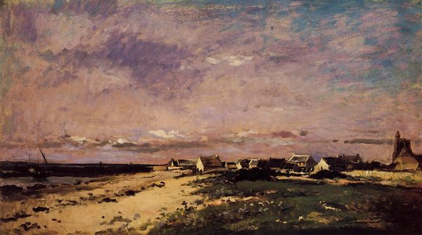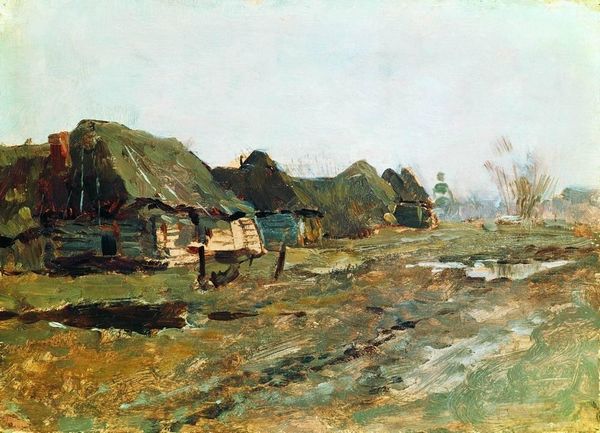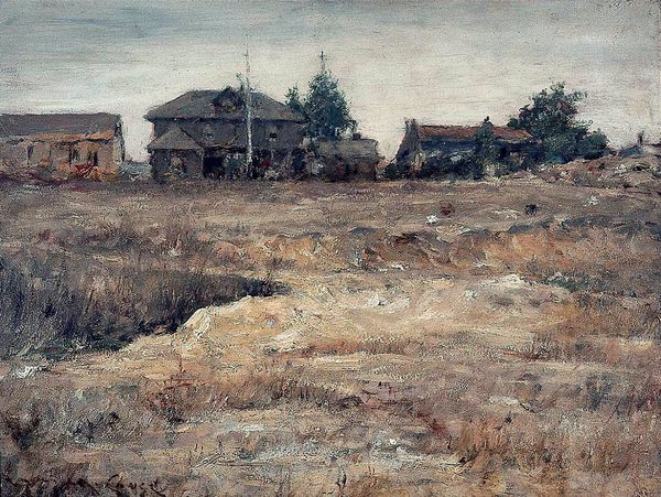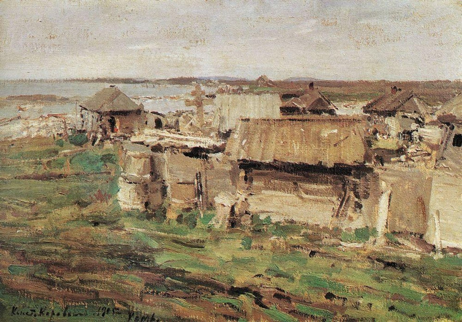
1905
Type of settlement
Listen to curator's interpretation
Curatorial notes
Konstantin Alexeevich Korovin made this painting, Type of settlement, with oil on canvas. The colours are close in tone and value, creating an overall feeling of harmony, while his brushstrokes create a sense of movement. It’s like Korovin wasn’t trying to capture a specific place but more a feeling. The surface of the canvas is alive with paint, thick and juicy in some areas, thinner and more transparent in others. You can almost feel the push and pull of the brush as he worked. Look at the way he’s rendered the buildings. They’re not precise or detailed, but rather suggested with broad strokes of colour. There’s a particularly nice bit just above the horizon line, where the grey of the sky meets the beige and brown of the village and land, so that the forms almost dissolve into each other. It’s a bit like how, when you are painting, you often find the best moments in the in-between spaces. The closest influence to Korovin may be Camille Pissarro. Like Pissarro, Korovin embraces the idea that a painting can be a record of the artist’s process. It’s less about capturing a perfect image and more about exploring the possibilities of the medium.