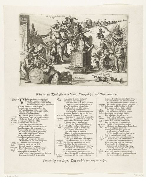
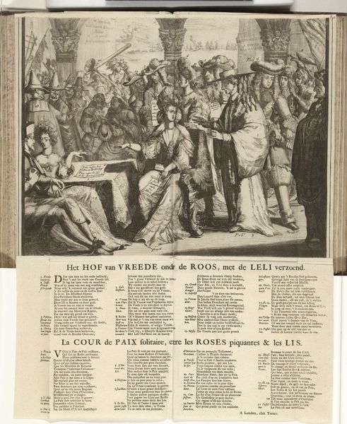
Spotprent waarin het verlies van Namen niet opweegt tegen de overwinning bij La Hogue, 1692 1692
0:00
0:00
anonymous
Rijksmuseum
print, engraving
#
allegory
#
baroque
# print
#
pen illustration
#
cityscape
#
history-painting
#
engraving
Dimensions: height 414 mm, width 294 mm
Copyright: Rijks Museum: Open Domain
Curator: This print, dating from 1692, is titled "Spotprent waarin het verlies van Namen niet opweegt tegen de overwinning bij La Hogue," which translates to something like "Satirical print in which the loss of Namur does not outweigh the victory at La Hogue." It's currently held at the Rijksmuseum. What are your first thoughts? Editor: It's visually dense. The scales of justice dominate the scene, and I am drawn to the sharp contrasts in light and shadow that emphasize the symbolic weighting of the French naval victory against some type of loss. There's a real dynamism in its formal construction, almost theatrical. Curator: Absolutely. The print, employing engraving, offers a glimpse into the material and social circumstances surrounding the war. We have on one side Louis XIV and what looks like troops and wealthy society women, and on the other what seem to be ships or some version of that on the scales. Editor: Yes, the central metaphor hinges on that balance. It highlights that despite the victory at La Hogue, the French, according to the image's narrative, have still ultimately lost more than they have gained. And even beyond that point, consider the materials. As an engraving the dissemination possibilities are vastly multiplied. Curator: It’s important to consider that the print aimed at shaping public sentiment, serving as a form of propaganda. The symbolic scales would certainly evoke contemporary understanding of the balance of power during the war, the social tensions inherent in financing Louis XIV's ambitions and the production and consumption of such imagery in a wider context. Editor: Agreed. The placement of Louis XIV with society women also reads in terms of a value system—what is precious versus the military industrial complex being conveyed in miniature as model boats. The very process of turning a major conflict into digestible visual bites is, formally speaking, remarkable, regardless of the social ramifications. Curator: Seeing it through that lens, the Baroque style takes on a new meaning, emphasizing spectacle but also underlying a critique. Editor: It all comes down to balance and proportion, doesn't it? What is given, what is taken—and what the forms and styles communicate subliminally and overtly. The anonymous artist understood the power of that very material exchange. Curator: Indeed, seeing the conflict reduced to the matter of the print itself really exposes the economic engine driving the historical context. Editor: An effective example of material and symbolic interplay. Thank you for bringing that historical and contextual depth into my reading of it.
Comments
No comments
Be the first to comment and join the conversation on the ultimate creative platform.
More like this