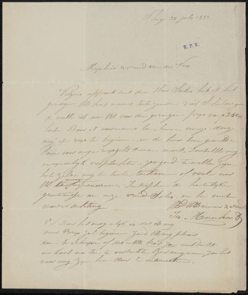
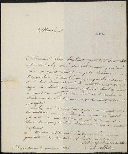
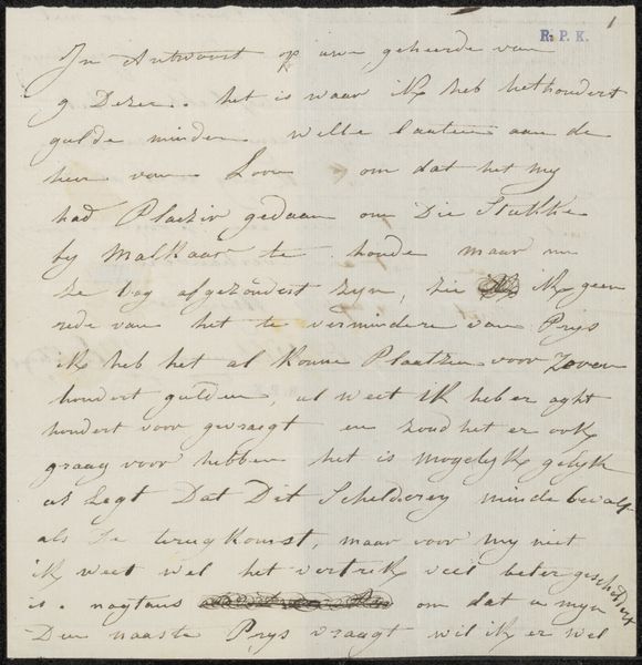
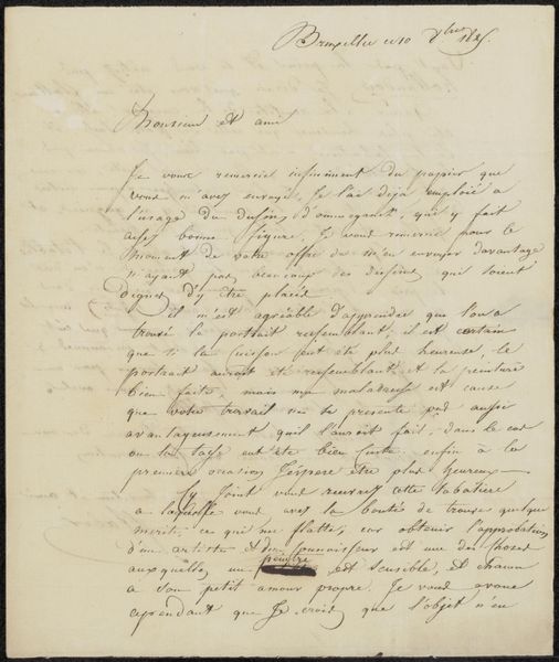
drawing, paper, ink, pen
#
drawing
#
paper
#
ink
#
pen
#
calligraphy
Copyright: Rijks Museum: Open Domain
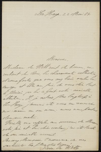
Curator: Good morning! I’m excited to discuss this intriguing piece by Jan Veth. Editor: Thanks! This is "Brief aan Etha Fles," possibly from 1901. It's ink on paper, so a drawing, but it looks more like handwriting—really beautiful calligraphy. It's clearly a letter, but the huge lines drawn through it make it appear cancelled, discarded. What do you see in this work? Curator: The lines certainly complicate our understanding. Were these added by the artist? By the recipient? And what did it mean to share that cancellation so publicly, so many years later? What was it that Veth felt wasn't appropriate? What cultural values are visible through these visual disruptions, I wonder? Is this letter meant to be read? Can it? Editor: Maybe not, I can’t make out any words in modern Dutch. Curator: I think the point isn't what the words said, but who he was. Jan Veth, a prominent figure in the Dutch art world. But who was Etha Fles to him? Do you notice it is addressed to a woman? I am curious to consider its gender dynamics of communication and control from Veth’s position. Editor: So the cancellation itself becomes a statement? That’s so interesting; I initially focused on the aesthetic quality of the handwriting itself. Curator: Precisely. These layers of intervention can also provoke some difficult questions around how we preserve such traces of power today and how context plays such a crucial role in appreciating artistic expression. Editor: I hadn't considered the complexities of displaying a "cancelled" message! That's made me see it in a completely new way. Curator: Absolutely. Thinking through all these considerations has brought into relief aspects of its gender and socio-political meaning.
Comments
No comments
Be the first to comment and join the conversation on the ultimate creative platform.
More like this