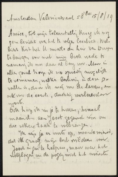
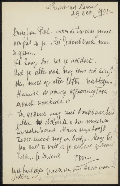
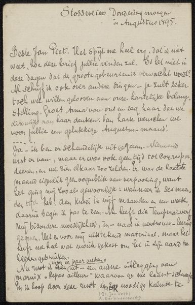
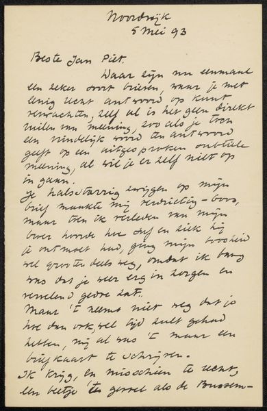
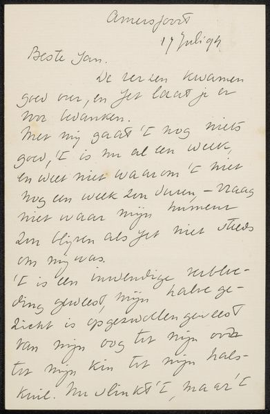
drawing, paper, ink
#
drawing
#
paper
#
ink
#
genre-painting
Copyright: Rijks Museum: Open Domain
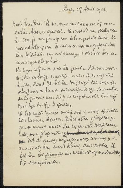
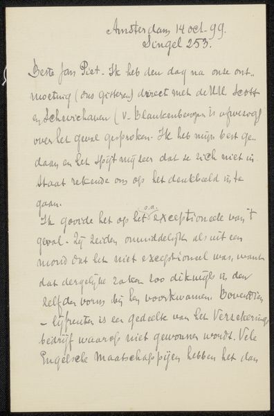
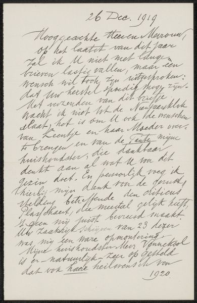
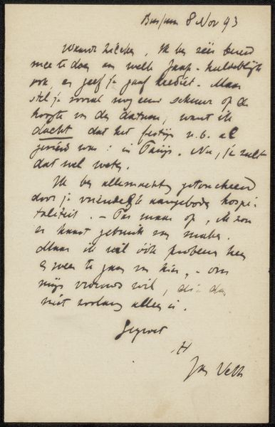
Curator: Today, we’re looking at “Brief aan Jan Veth” which roughly translates to “Letter to Jan Veth” by Antoon Derkinderen. The piece is dated sometime between 1874 and 1925 and it’s rendered in ink on paper. Editor: It feels unusual to discuss a letter as an artwork. The tight handwriting, the density of the ink – what can you tell me about this work from a Formalist point of view? Curator: Consider the density of the lines. See how the artist’s hand creates varied strokes – thick in places, then thin? The visual rhythm gives the page a unique texture, almost sculptural in its presence. How do you think the artist uses the white space around the strokes? Editor: It definitely keeps the work from feeling too heavy. The way the lines float creates an interesting juxtaposition against the rigid structure of the letter itself. Curator: Precisely! Notice the flow and connections between each line of text, and within each stroke. Derkinderen plays with movement versus stillness by maintaining uniform direction. In that regard, it appears like a musical score. Would you agree? Editor: I hadn't thought of that, but it makes perfect sense! Seeing the piece less as a static document and more as a dynamic arrangement makes me appreciate it even more. Curator: And from this approach we're able to examine its construction, movement, balance, and unity – revealing elements of design within this handwritten text, allowing us to see it beyond a simple document, even as art. Editor: Thanks to you, I will forever see beyond the face value of such artistic handwriting pieces, which will transform my ability to appreciate art in every-day materials.
Comments
No comments
Be the first to comment and join the conversation on the ultimate creative platform.
More like this