print, textile, paper, typography
# print
#
textile
#
paper
#
typography
Copyright: Rijks Museum: Open Domain
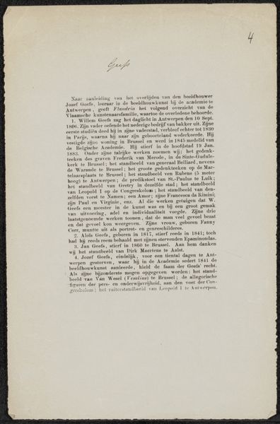
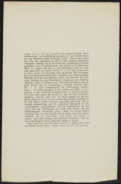
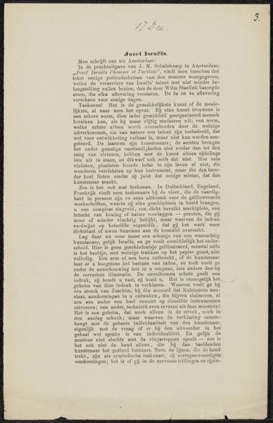
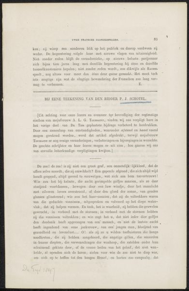
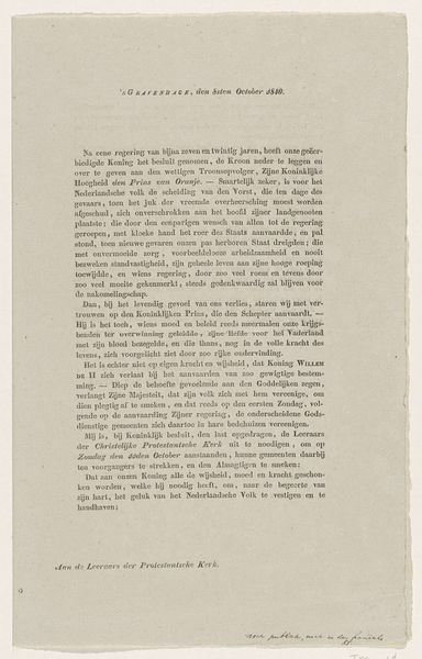
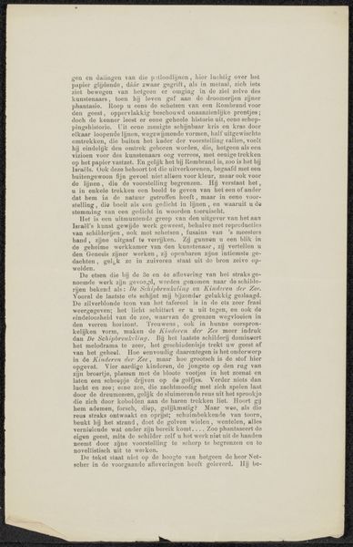
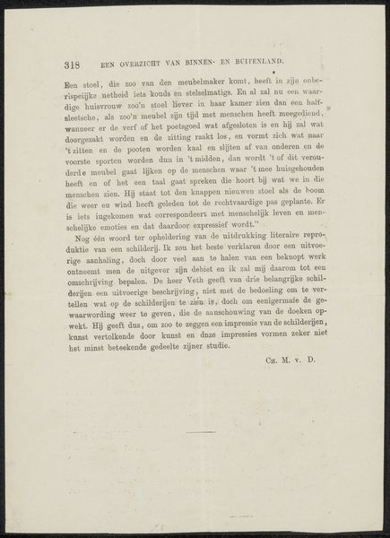
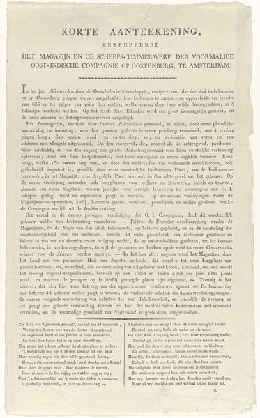
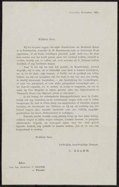
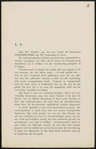
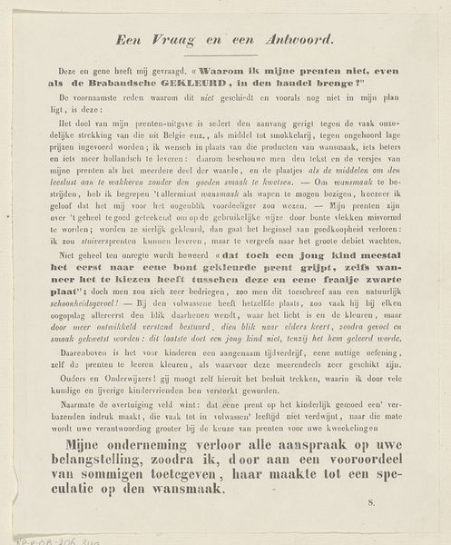
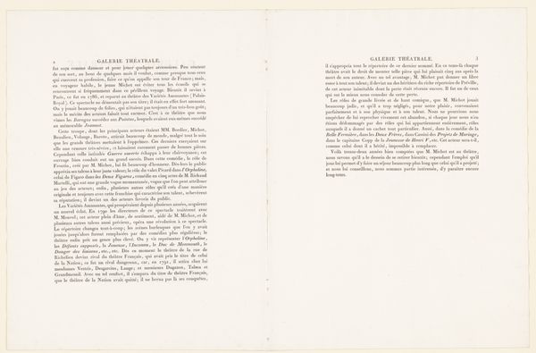
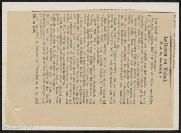
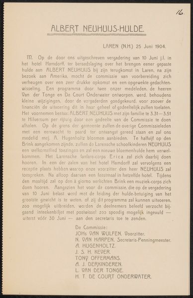
Editor: This is a printed page from the archive of Jan Veth, dating around 1919, related to Alphons Diepenbrock. It seems to be a biographical text, almost like a program note. What do you see in this piece beyond the immediate information? Curator: The typography itself evokes a certain period, doesn’t it? Look at the typeface and the layout. It speaks to an era of formal presentation, of careful construction of public image. The page, a seemingly simple object, serves as a cultural artifact, preserving memory and values about musical genius. Editor: So, you're saying that even the design carries meaning beyond the text itself? Curator: Absolutely. Consider the conscious effort put into immortalizing Dirk Schäfer. The language is elevated, celebratory, establishing his legacy. We are not just reading facts, but encountering a carefully constructed narrative intended to resonate. What symbols can we glean from the paper and typography used? Editor: I suppose the formal, almost classical typeface conveys a sense of established tradition, linking Schäfer to the canon of great musicians. Curator: Precisely! And note the potential for implied social hierarchies; access to musical training and instruments was severely limited, especially pre-World War II. In effect, documents like this became sacred relics in that culture. Is the composition telling us who Schäfer was, or rather, who someone *wanted* him to be? Editor: I hadn't considered how deliberate the presentation might be. Now, I am curious about the choices in language used. Curator: Think about it: through visual and textual symbols, these documents built collective cultural understanding of accomplishment and legacy, shaping who we collectively chose to remember. What are the lasting impacts?
Comments
No comments
Be the first to comment and join the conversation on the ultimate creative platform.
