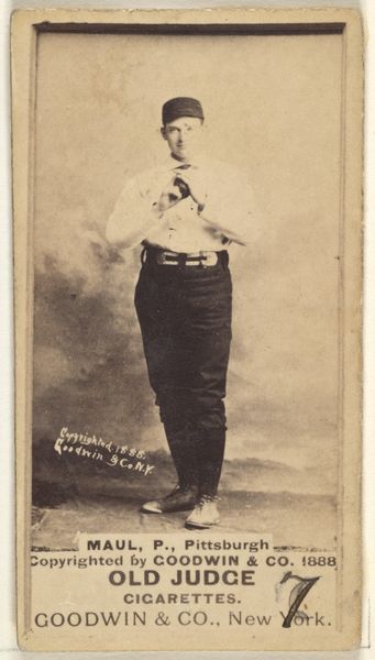
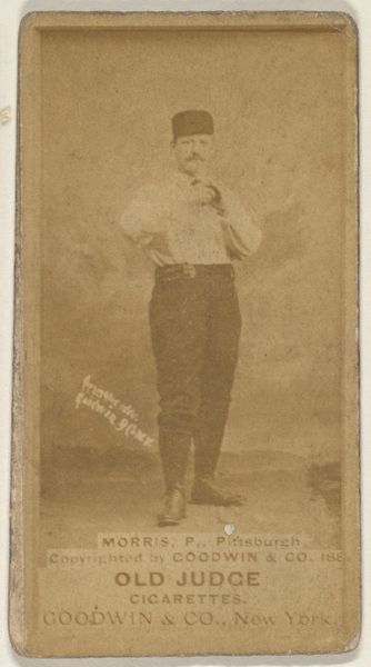
Al Maul, Pitcher, Pittsburgh, from the Old Judge series (N172) for Old Judge Cigarettes 1888
0:00
0:00
print, photography
#
portrait
# print
#
baseball
#
photography
#
men
#
athlete
Dimensions: sheet: 2 11/16 x 1 3/8 in. (6.9 x 3.5 cm)
Copyright: Public Domain
Editor: Here we have "Al Maul, Pitcher, Pittsburgh," a baseball card print from 1888 by Goodwin & Company. The sepia tones give it a really antique feel. The figure's pose seems staged but dignified. What compositional elements stand out to you? Curator: I find the contrasting textures most compelling. Observe the sharp, almost clinical, clarity of Maul's face against the soft, almost painterly, background. This interplay between the distinct subject and the blurred environment creates a visual hierarchy. Editor: So, the contrast isolates Maul. I also notice the figure bisects the composition, is this important? Curator: Precisely. This central alignment reinforces the subject's prominence and authority. Furthermore, note the repetition of geometric forms: the rectangular shape of the card itself, echoed in Maul's stance, creates a sense of formal unity. The figure is, architecturally speaking, "framed." Editor: But what does the advert text at the bottom bring to it? The "Old Judge Cigarette Factory" feels a bit disruptive. Curator: Ah, that's the visual friction. Semiotically, it interrupts the potentially heroic image with a reminder of commerce. The sharp lines of the lettering are in direct contrast to the faded, softer elements of the image, further creating that formal disharmony. It compels the viewer to reconcile seemingly competing languages. Editor: It’s interesting to think of advertising as contributing, or perhaps undermining, the other visual components in that way. Thanks. Curator: Indeed, and through this tension, a richer narrative emerges—one that speaks to the intersection of celebrity, commerce, and representation in late 19th-century America.
Comments
No comments
Be the first to comment and join the conversation on the ultimate creative platform.
More like this