drawing, paper, ink
#
drawing
#
toned paper
#
blue ink drawing
#
figuration
#
paper
#
ink
Dimensions: height 348 mm, width 246 mm
Copyright: Rijks Museum: Open Domain
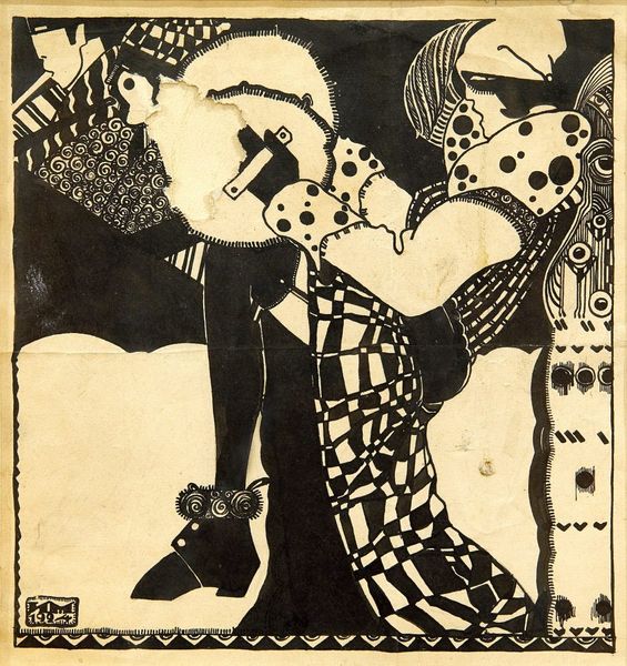
Curator: Here we have a drawing, executed in ink on paper, by Bernard Willem Wierink. The work, whose dates range from 1866 to 1939, is rather mysteriously titled "Isegrim voor koning Nobel", now held in the Rijksmuseum. Editor: Immediately striking. It's divided into two vignettes, creating a binary—a sharp visual contrast using only tonal variation to differentiate forms. The application of blue ink offers depth. It almost reads like two acts from an obscure play. Curator: Well, I find the juxtaposition incredibly compelling. On one side, the traditional Sinterklaas iconography jumps out— the saint riding over rooftops, benevolence emanating from the stars and hearts. But juxtapose that next to the other image, perhaps rooted in folklore... it sparks all sorts of ideas about the continuity of tradition and adaptation of historical stories. Editor: Speaking purely from a design point of view, the arched framing gives a very stylized and constructed appearance to the Sinterklaas illustration—not dissimilar to old playing cards or perhaps the printing on tins. Meanwhile, the other figure, more chaotic and perhaps personal. What narratives are being woven between the two, how is Wierink asking us to connect them? Curator: Yes, Wierink presents archetypes—cultural figures of virtue and, in the case of Isegrim— a figure perhaps not always on the right side of virtue if we remember that name in European fables... Together, these might invoke powerful collective memories and psychological frameworks rooted in childhood narratives. The tonal drawing adds weight and a connection across time. Editor: Perhaps that choice of deep, Prussian-blue ink flattens the image and calls attention to the formal design of it—the graphic element of the page—but doesn't add to the depth, paradoxically so... the flat forms become characters or signifiers in a two dimensional play or narrative... It's rather elegant. Curator: I would argue it's that elegance itself that reveals something potent. These enduring characters, repackaged in blue ink, continue to exert a very powerful hold over us through this choice of simple shapes...it encourages contemplation and deeper inspection. Editor: Absolutely. This drawing presents a beautiful intersection of style and historical storytelling. Wierink’s piece, although modest in its materials, uses structural clarity to make you contemplate its implicit, narrative ambiguities and complex historical interplays. Curator: And through those design and stylistic choices, we are connected through our heritage... perhaps our most deeply embedded feelings about justice, storytelling, and who we are.
Comments
No comments
Be the first to comment and join the conversation on the ultimate creative platform.
More like this