print, woodblock-print
# print
#
asian-art
#
ukiyo-e
#
woodblock-print
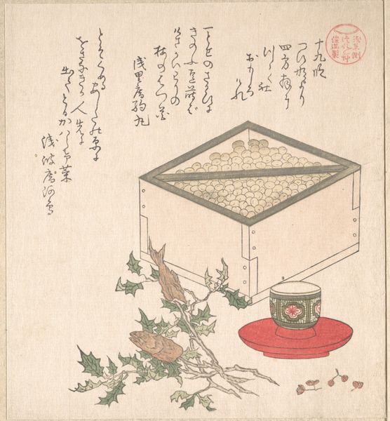
Dimensions: height 20.0 cm, width 17.8 cm
Copyright: Rijks Museum: Open Domain
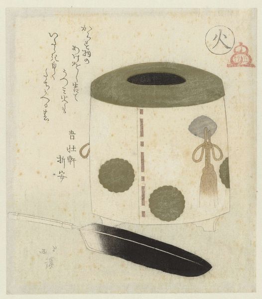
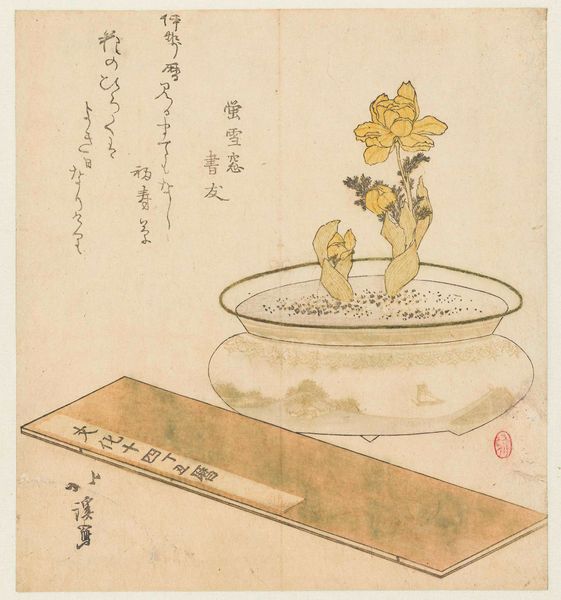
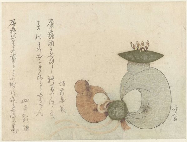
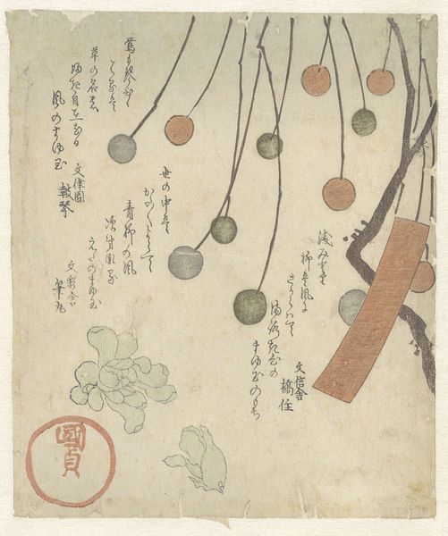
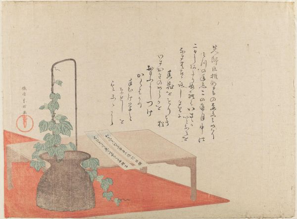
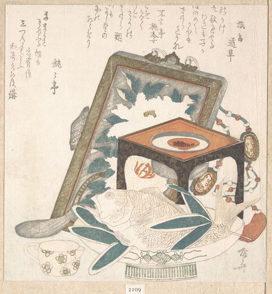
Curator: Welcome. We’re now looking at a work whose title translates to "My Street: Bronze Vase and Five Procession Bells.” It's a woodblock print, dating from around 1819. Editor: It feels rather austere. Stark contrasts and limited shading lend it an air of meditative stillness. The visual hierarchy is very intriguing as well. Curator: The artist, from what we can tell, was primarily active within the circles of Edo period painting in Japan. This piece is an exemplary product of Ukiyo-e. You can almost discern social class through what these things represent. The vase might suggest a domestic stability while the bells... Editor: ...disrupt that sense of stability, introducing an element of ritual. Their orderly arrangement contrasts nicely with the bolder vase. I'm curious about the almost shadow-like representation; this print's flatness subverts any true spatial depth, calling more attention to its 2D construction. It does make the image feel timeless somehow. Curator: That flatness is so essential to Ukiyo-e style. Consider, also, the social stratification this print implicitly acknowledges. Bronze vessels and bells, everyday objects, and high religious and artistic concepts are all bound together by the constraints of culture, taste and availability. Editor: Yet despite the cultural coding you mentioned, the aesthetic purity is unavoidable. Look at the use of negative space around the vase. It isn’t just emptiness. It shapes the object by defining the forms of everything which isn’t the vessel itself. I find it compelling how the shapes and spaces play into the textual aspects and back again in an echoic call-and-response. Curator: Precisely. The written elements of the piece complement its thematic qualities. Every aspect, no matter how small, interacts with everything else in ways designed to both enrich meaning and direct interpretations thereof. I think it gives voice to many of its inherent contextual tensions and resolutions, really. Editor: Well, for me it proves how strong visual syntax can create such interesting tensions within its simplicity. It suggests more than it dictates. Curator: That’s an important distinction. Thank you for pointing that out.
Comments
No comments
Be the first to comment and join the conversation on the ultimate creative platform.
More like this