Uitnodiging voor de tentoonstelling van kunstenaarskring La Chrysalide 1876
0:00
0:00
felicienrops
Rijksmuseum
drawing, graphic-art, print, etching, ink, poster
#
drawing
#
graphic-art
# print
#
etching
#
old engraving style
#
ink
#
ink drawing experimentation
#
pen-ink sketch
#
pen work
#
symbolism
#
pencil work
#
poster
Dimensions: height 247 mm, width 128 mm
Copyright: Rijks Museum: Open Domain
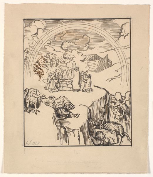
Editor: Here we have “Uitnodiging voor de tentoonstelling van kunstenaarskring La Chrysalide,” or, "Invitation to the Exhibition of the Artists' Circle La Chrysalide", a print by Felicien Rops from 1876. It seems to be a poster of sorts, rendered with fine lines. The whole thing has this strange, whimsical mood about it. What strikes you about the composition? Curator: The image presents a fascinating formal arrangement. Note the density of marks concentrated in the upper register, a visual clustering that commands immediate attention. The juxtaposition of meticulously etched detail above, and the relatively bare textual information below creates a dialogue, doesn’t it? What purpose could such contrast serve, aesthetically? Editor: It does create a hierarchy. Is that use of space effective, given that it’s advertising text? Curator: Indeed. The symbolism here is key. Butterflies and a casket are presented with care, rendered using delicate and dense networks of etched lines that construct shape and imply texture, as are figures worked into the letters of the text, while the textual elements become almost incidental, their linearity a sharp contrast to the ornamentation. We must look at the relationship between text and image. Are we meant to see both as equally important, or is there something else happening? Editor: So you're suggesting the lettering almost functions as a decorative element, blending into the image itself. I suppose I hadn’t considered that. Thanks, it’s interesting to consider that push and pull. Curator: Precisely. It is in that visual tension between function and form, legibility and embellishment, that the work establishes its character. It is this very push and pull that elevates the object above pure informational ephemera and creates something much more aesthetically enduring.
Comments
No comments
Be the first to comment and join the conversation on the ultimate creative platform.
More like this