print, etching
#
ink drawing
#
baroque
#
dutch-golden-age
# print
#
etching
#
landscape
Dimensions: 70 mm (height) x 102 mm (width) (bladmaal)
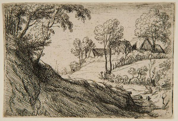
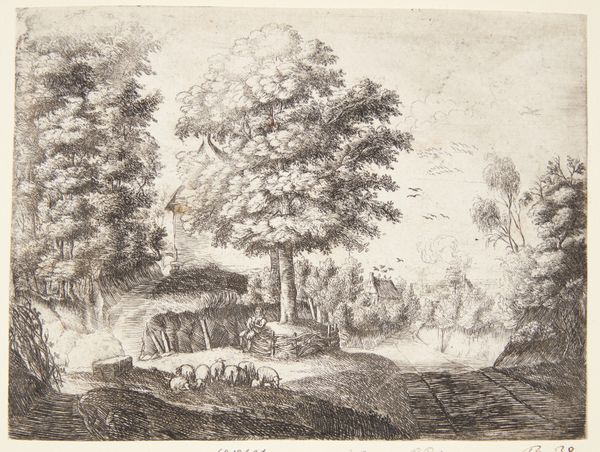
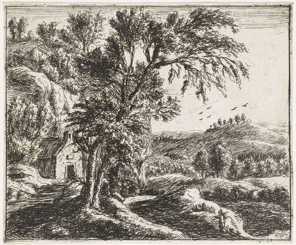
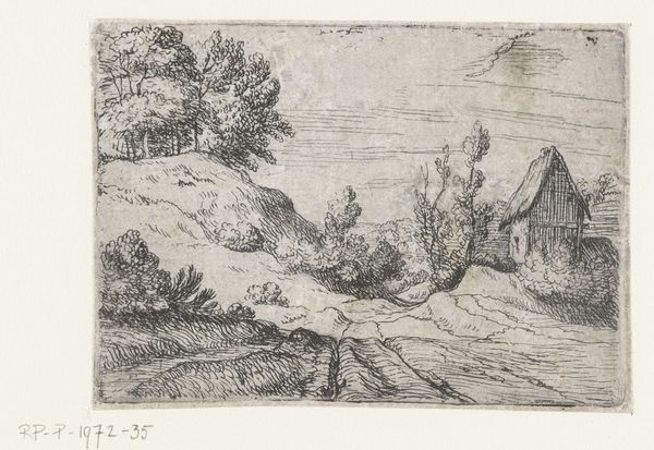
Editor: We're looking at Lodewijk de Vadder's "Village on Top of a Hill", made sometime between 1605 and 1655. It's an etching. I’m immediately struck by the contrast between the densely worked foreground and the much lighter touch used for the village. It almost feels like two separate studies merged into one. How do you read the composition? Curator: Indeed, the spatial articulation is of great interest. Observe the dense hatching that defines the foreground, creating a palpable sense of depth and texture. This contrasts with the more delicate lines used to depict the village. How does this interplay of textures and line weights contribute to your understanding of space within the composition? Editor: I see what you mean. The sharp, deep lines of the hill draw you in. They are practically tactile. Then your eye kind of floats over the village because the lines are so much lighter. It creates distance, almost like an atmospheric effect. Curator: Precisely. Consider the use of line as a signifying system. The density of line correlates to perceived proximity, while its relative sparseness suggests recession into the distance. Furthermore, the very lack of color necessitates an emphasis on tonal values and compositional arrangements to convey spatial depth. Note also the interplay between the organic forms of the trees and the geometry of the buildings. Do you perceive a tension between these elements? Editor: Definitely. The trees seem wild, almost chaotic in their rendering, compared to the neat, angular roofs of the buildings. It gives a sense of the village being a small, structured element in a larger, more untamed landscape. It brings to mind an inherent friction between people and nature. I initially found the picture kind of basic, but now it seems full of all kinds of formal complexities! Curator: Indeed. By examining the formal qualities—line, texture, composition—we reveal the artist's subtle strategies for engaging with notions of space, depth, and the dialectical relationship between humanity and nature. Editor: Thanks, I’ve gained a new appreciation for just how much is communicated through those techniques!
Comments
No comments
Be the first to comment and join the conversation on the ultimate creative platform.
More like this