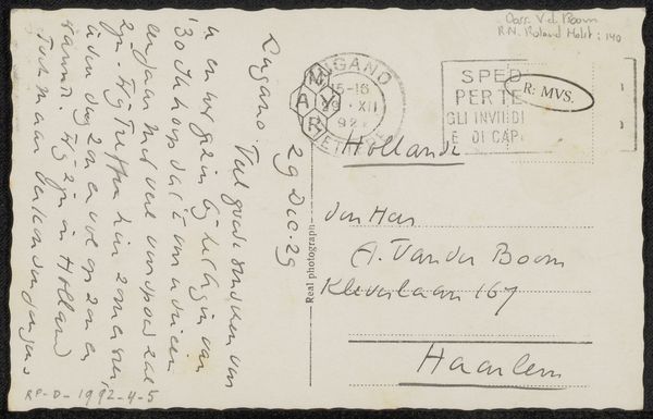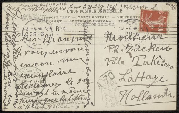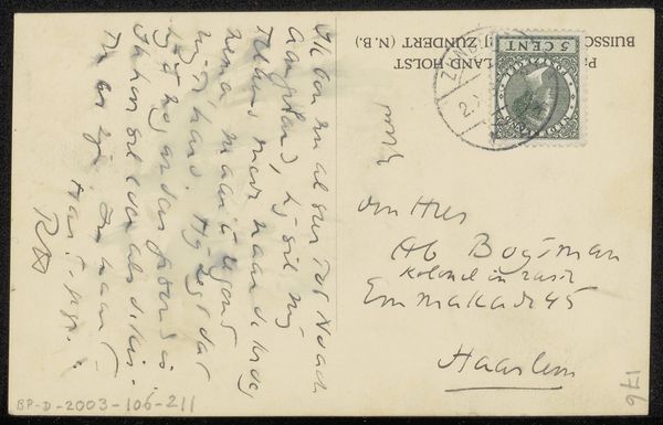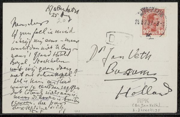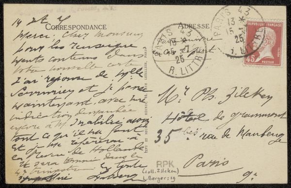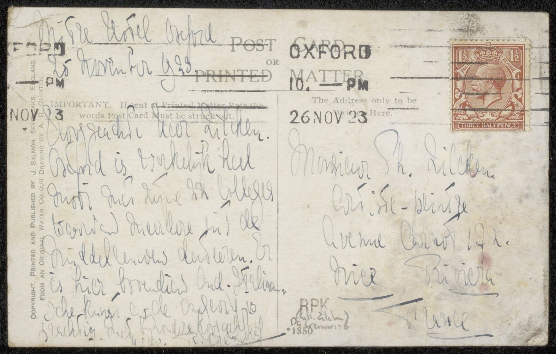
Possibly 1923
Prentbriefkaart aan Philip Zilcken
Listen to curator's interpretation
Curatorial notes
Curator: Here we have a curious piece from probably 1923, "Prentbriefkaart aan Philip Zilcken"—"Picture Postcard to Philip Zilcken," as it translates. Rendered in ink on paper, it showcases a rather fascinating use of calligraphy. Editor: My initial impression is of frantic, almost chaotic energy. The text is dense and appears quickly scrawled, filling almost every available space. It feels less like formal calligraphy and more like personal correspondence in a hurry. Curator: Precisely! This speaks to the era—consider the rise of personal communication amidst post-war societal shifts. Postcards became increasingly popular for quick, affordable contact. Who were Zilcken and Cremers, and what was the urgency they may have felt to express? It gives us a personal glimpse into the everyday texture of life in the 1920s. The style suggests informality—not necessarily an artistic exercise but rather a means to quickly relay information or affection. Editor: Agreed. Focusing on the visual elements alone, note the composition: the contrast between the clearly defined address and stamp section versus the free-flowing script. It creates an interesting tension between function and expression. Also the letter forms, the varied weight of each line, the repeated shapes and heights. Curator: And beyond the surface level calligraphy, consider the actual message conveyed. If the handwriting reflects the writer’s state of mind, and it may indeed do that to a certain extent, one wonders what urgent message impelled such density. Each looped letter is potentially brimming with meaning beyond its denotation. Also, the physical nature of the postcard as a carrier of sentiments and images makes it inherently about interpersonal and historical context. Editor: I'm intrigued by how the very density and texture of the ink become carriers of meaning beyond just legibility. You mentioned that duality with intent and the personal side of it; in viewing this through the elements and principals we find yet another dimension to it, wouldn’t you agree? Curator: Absolutely. Studying this unassuming postcard shows it embodies artistic creation, even beyond intent, and how the social meets the personal in singular expression. Editor: A humble piece yet an amazing little world! Thank you!