#
impressionistic
#
abstract expressionism
#
abstract painting
#
landscape
#
impressionist landscape
#
fluid art
#
neo expressionist
#
abstract nature shot
#
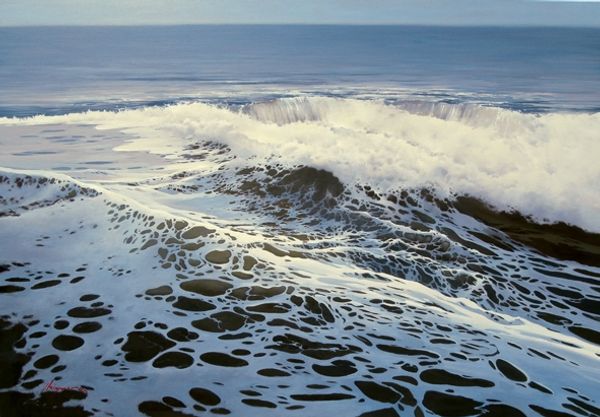
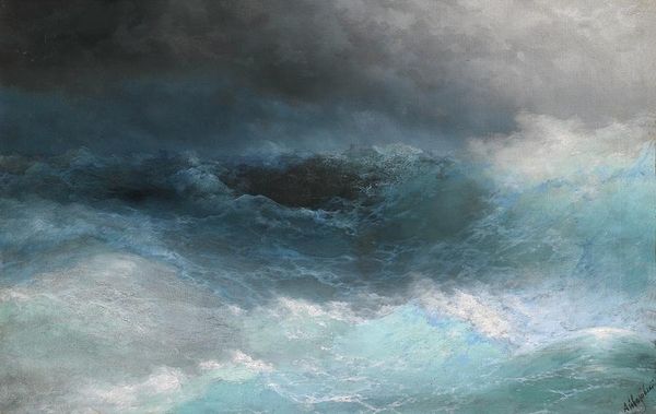
seascape
#
abstract art
#
expressionist
Copyright: Modern Artists: Artvee
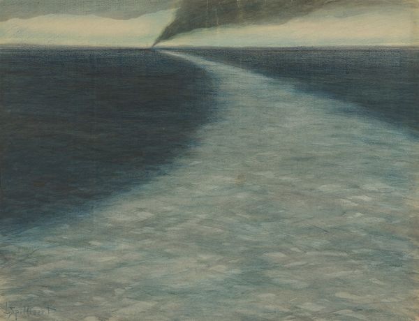
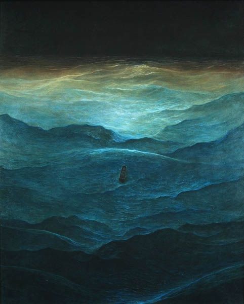
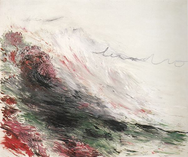
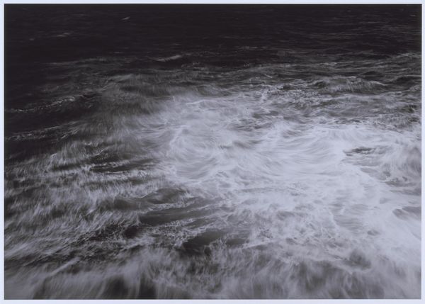
Curator: Bo Bartlett's "Sea," created in 2000, presents us with a vast expanse of water. What are your initial thoughts? Editor: My first impression is one of serene disquiet. The muted color palette, dominated by dusky purples and browns, creates a sense of calm, but the undulating surface hints at something more restless beneath. The composition, largely unbroken by any horizon, has a peculiar intimacy for a landscape. Curator: Intimacy is a crucial observation. Let's examine the use of color and light. Notice how the variations of tone, specifically in the treatment of water, convey a rich dynamism? The brushstrokes suggest light not simply reflecting, but being absorbed and refracted. Editor: Indeed. But the societal context cannot be overlooked. Created in 2000, this painting comes at the cusp of global digital saturation, arguably a last-ditch attempt to hold onto physical immersion. The brown water could easily read as polluted rather than romantic when viewed through a contemporary lens. It becomes less about the sublime, more about our impact. Curator: An important, though perhaps less generous, interpretation. However, the lack of classical painterly structure draws the eye deeper into itself. Look at the subtle modulations; it feels less like objective representation and more akin to an internal state expressed. The near monochromatic field invites subjective interpretation over explicit narratives, no? Editor: But even the subjectivism carries social baggage! Romanticising a pre-digital state inherently critiques contemporary culture. Landscape paintings have long acted as veiled ideological statements, and I feel Bartlett is speaking to this tradition. Where does humanity fit within this shifting landscape? Where do WE fit, as his audience? Curator: Well, to bring us back to the artistic design: the eye follows along these shifting lines of dark against the pearlescent violet backdrop of water… the texture is practically built by layers of tonal relations... It does make a very clever show of artistic skill. I have new appreciation, as always. Editor: Likewise. The way our different experiences shape how we see are important factors, especially when approaching historical artwork. Thank you.
Comments
No comments
Be the first to comment and join the conversation on the ultimate creative platform.
More like this