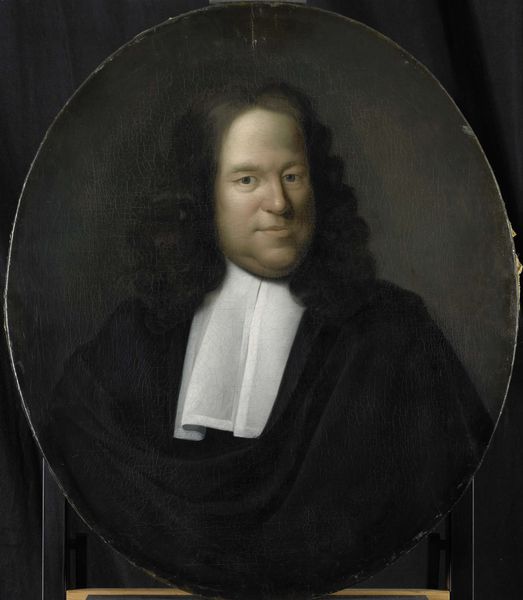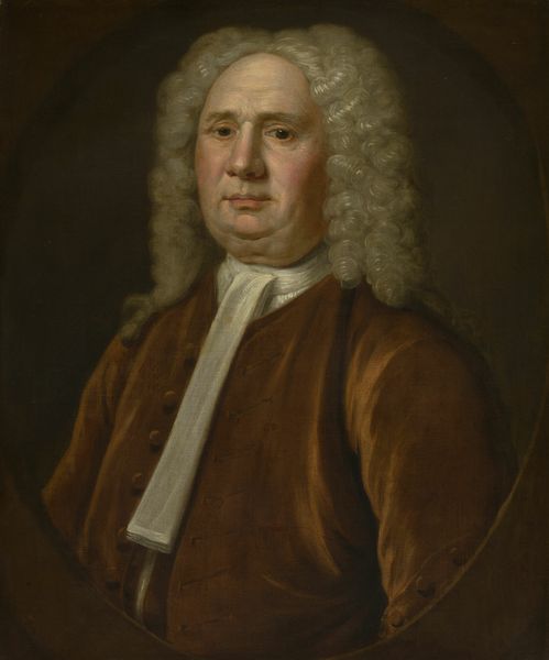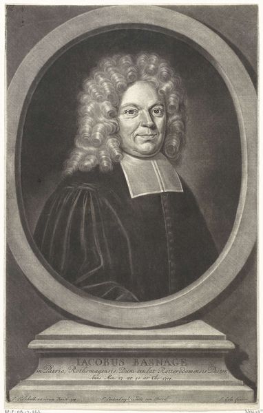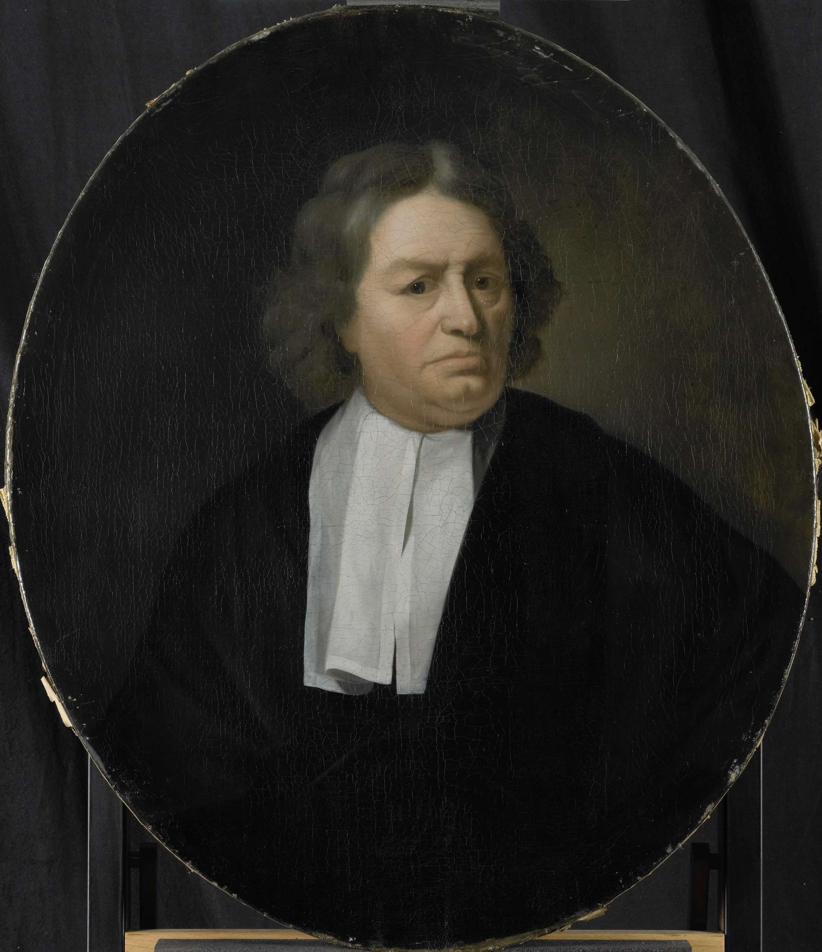
1695 - 1722
Portrait of Jan van der Burgh, Director of the Rotterdam Chamber of the Dutch East India Company, elected 1649
Listen to curator's interpretation
Curatorial notes
Curator: Pieter van der Werff painted this striking oil portrait of Jan van der Burgh between 1695 and 1722. Van der Burgh was an influential Director of the Rotterdam Chamber of the Dutch East India Company. Editor: Gosh, he doesn’t look overjoyed, does he? There's something a bit… stern, shall we say, about the overall composition. He's a serious fellow, seemingly trapped in that dark oval, staring right at us with a silent, but heavy air. Curator: The almost monochromatic palette—dominated by blacks and subtle creams— certainly enhances that impression. Consider the meticulous brushwork, too. Van der Werff skillfully models the planes of the face, emphasizing van der Burgh's authority through a detailed realism characteristic of Dutch Golden Age portraiture. Editor: I agree! The way the light catches his cheek and forehead makes him look very real. It’s odd that the portrait appears to be an oval, within the full dimensions of the canvas. Like looking at someone through an old submarine portal. Also that simple white collar adds the only other highlight besides his face. Almost a spotlight! It feels very… curated, a word choice you might appreciate! Curator: Precisely. The limited colour scheme directs the viewer's attention, ensuring a tight focus on van der Burgh’s facial expression and overall demeanor. And you make an excellent point about the framing adding an artificial construct, placing van der Burgh in a position of societal authority, but within carefully controlled confines. Editor: I can see why you find this portrait such a good example of formal execution. Although simple in style and color, its composition really does deliver van der Burgh as the master of his domain, with maybe the cost of sacrificing a bit of fun! But, then again, it may very well be a glimpse into the man himself. I guess we’ll never know… Curator: Ultimately, the painting reflects the Dutch Baroque style's preference for naturalism combined with structured compositional rigor, rendering its subject with a sense of weight, consequence and purpose. Editor: All adding up to one very serious-looking company director staring back through time.