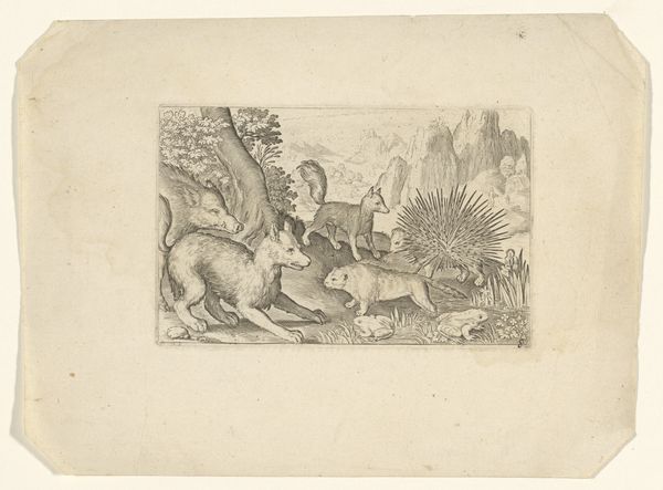
drawing, paper, pencil
#
drawing
#
landscape
#
figuration
#
paper
#
romanticism
#
pencil
#
history-painting
Copyright: Public Domain
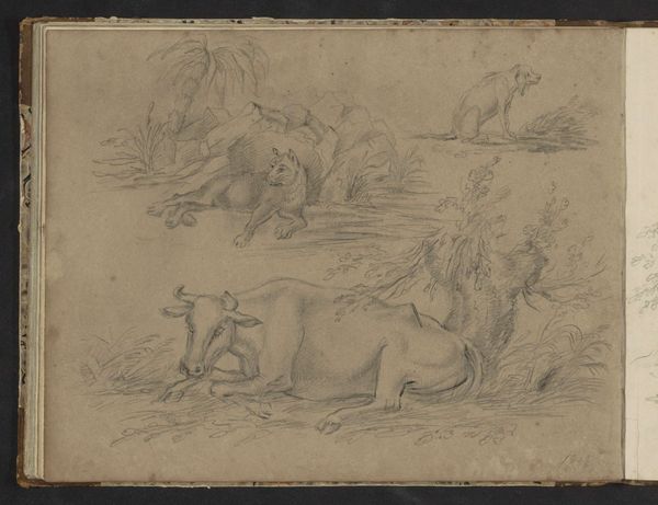
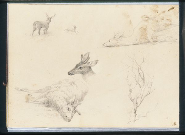
Editor: Here we have Hans Thoma's "Skizzenbuch," dating back to 1850, currently held at the Städel Museum. It's a pencil drawing on paper, arranged in these intriguing quadrants. There's a certain dreamlike quality to it, wouldn’t you say? All these animals and figures juxtaposed. What catches your eye most about this composition? Curator: Immediately, the formal structure. The artist's division of the page into four distinct but interconnected panels asserts a deliberate framework. The composition, line, and tonal range guide our understanding. Thoma meticulously crafts each quadrant with diverse forms. Consider the upper-right panel with its stark linearity versus the lower-left with its curvature and organic lines. How does the artist want the viewer to perceive the relation between these differing structures? Editor: I hadn’t considered the relationship between the quadrants like that. So you're suggesting the contrast isn't just random but intentional? Is there a sense of symmetry, even if the content differs wildly? Curator: Exactly. Symmetry isn’t about identical mirroring. It’s about a balanced distribution of visual weight. Notice the interplay between positive and negative space across the entire work. The distribution guides our gaze throughout each panel. How does that affect your viewing of the whole page? Editor: Now I see it; there's this deliberate placement. It feels almost like a structured exploration of form itself, regardless of what's being depicted. Thank you; this insight changes everything. Curator: Precisely. Reflecting on the overall design unveils much more than what an isolated viewing reveals. The relationship between technique and structural decisions is worth exploring further.
Comments
No comments
Be the first to comment and join the conversation on the ultimate creative platform.
More like this