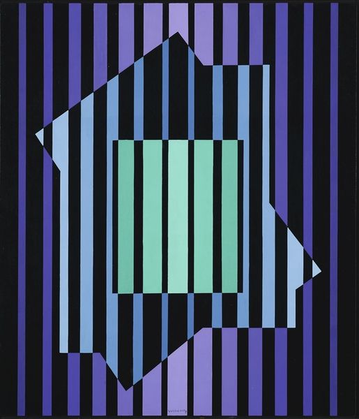
oil-paint
#
op-art
#
oil-paint
#
op art
#
geometric pattern
#
repetitive shape and pattern
#
geometric
#
geometric-abstraction
#
abstraction
#
pop-art
#
line
#
modernism
Copyright: Modern Artists: Artvee
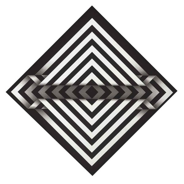
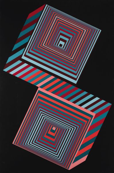
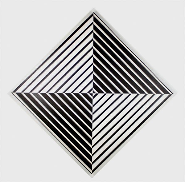
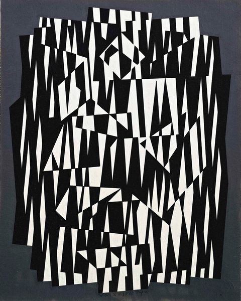
Curator: Up close, Victor Vasarely's "Mizzar" made between 1956 and 1961 hits you with this incredibly stark contrast. Oil on canvas—so classical in a way, yet the image itself feels like pure digital code. What's your first impression? Editor: Claustrophobia. That's the initial feeling, isn't it? A sort of geometric tightening. But in terms of color, it is a binary—an act of almost digital protest by analogue means. But the contrast gives me a bit of the chills. Curator: Yeah, the way that central white diamond is hovering, almost like a portal, while below those insistent white lines compress the space, you’re right, there’s something menacing, oppressive almost. Editor: This period of Vasarely's work, when he moved into what he called the 'planetary folklore' phase, is vital. The painting anticipates much later discussions about surveillance, technology's increasing power and visual control in ways that are startling to realize, now in hindsight. The diamond seems almost to surveil the flat geometry below. Curator: Do you think this intentionality was Vasarely´s goal though? For me this one pulls me between a feeling of deep unease, to thinking "wow these lines looks cool together". This feels a bit superficial. It has been argued that Vasarely wished to free art from the shackles of meaning, to bring us a sensory impact pure from references. Editor: That's an interesting point about liberating art from meaning but I can not dismiss art from their inherent historical embeddedness—we risk losing critical insight. Op-art itself was often interpreted, rightly or wrongly, as deeply related with commercial culture: a trend rather than an engagement in true aesthetic transformation. I think it does something deeper. I do wonder if a feeling of coldness could be what the artist actually meant by bringing technology into play, using geometric structures, the abstraction itself serves as this barrier against emotive expression. Curator: Hmmm... but the black and white choices…so simple, but so strong, giving me the chills thinking what could be there to expect just because is there to see it. It leaves your mind wandering. I agree on this being an aesthetic manifesto too! Editor: Well, as always, a potent mix of artistic intention and historical forces at play, making for far more than a pretty pattern. This piece reflects social anxiety and tension through shapes.
Comments
No comments
Be the first to comment and join the conversation on the ultimate creative platform.
More like this