print, photography
#
aged paper
#
script typography
# print
#
hand drawn type
#
landscape
#
german-expressionism
#
photography
#
hand-drawn typeface
#
thick font
#
cityscape
#
handwritten font
#
delicate typography
#
thin font
#
historical font
#
small font
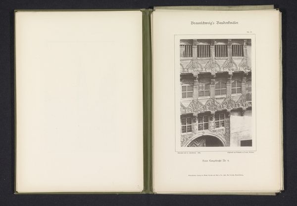
Dimensions: height 147 mm, width 102 mm
Copyright: Rijks Museum: Open Domain
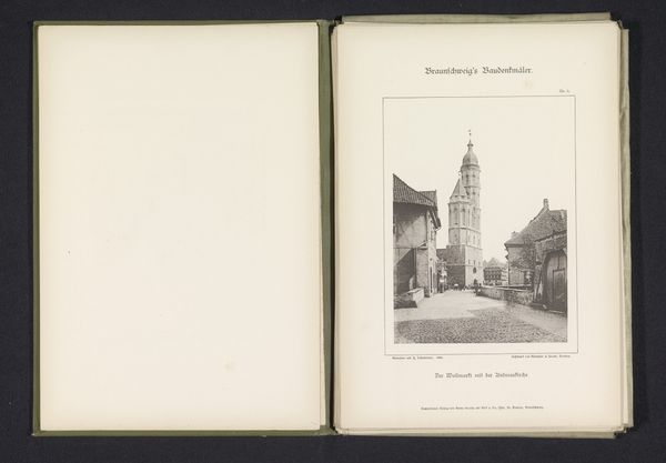
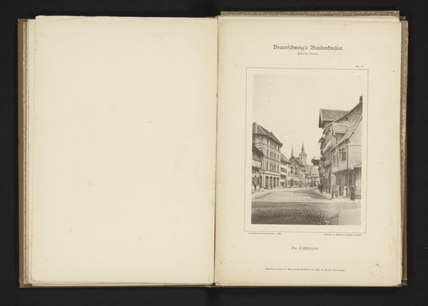
Editor: We're looking at "Gezicht op de Sint-Andreaskerk te Braunschweig," a print from 1892, by J. Schombardt. It's a cityscape, very grey, very detailed, and kind of…stark. What strikes you most about it? Curator: It’s a photograph presented as an artifact. Look at the framing within the larger open book format – it almost dares you to consider the act of observing and preserving. Doesn't the sharp detail pull you into the quiet street scene? I can almost smell the coal smoke. Editor: It does. It also feels very formal. Like it's documenting something important. Curator: Precisely. And consider the era – the late 19th century was obsessed with cataloging and classifying. Photography was a "scientific" tool, yet Schombardt framed it with this wonderfully archaic, almost calligraphic typeface. Is it science or memory? Fact or feeling? Editor: That’s interesting. It feels like a conflict, the crisp photo versus the almost old-fashioned typeface. Is that German Expressionism coming through? Curator: Perhaps a whisper of it. Look at how the heavy font looms over the delicate architecture, but also the light filtering between buildings – for me, the delicate typography seems almost hopeful in its presence there. What about you, changed your mind? Editor: Yeah, it's grown on me. I see that hopefulness now too, despite the starkness. It’s subtle but powerful. Curator: Wonderful isn’t it, how art reveals itself slowly? Like Braunschweig on a foggy morning, maybe.
Comments
No comments
Be the first to comment and join the conversation on the ultimate creative platform.
More like this