drawing, paper, ink, pen
#
drawing
#
pen sketch
#
landscape
#
etching
#
figuration
#
paper
#
ink
#
pen
#
cityscape
#
realism
Dimensions: height 230 mm, width 350 mm
Copyright: Rijks Museum: Open Domain
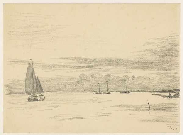
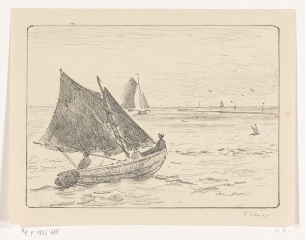
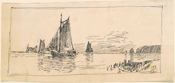
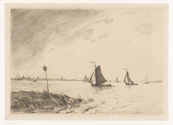
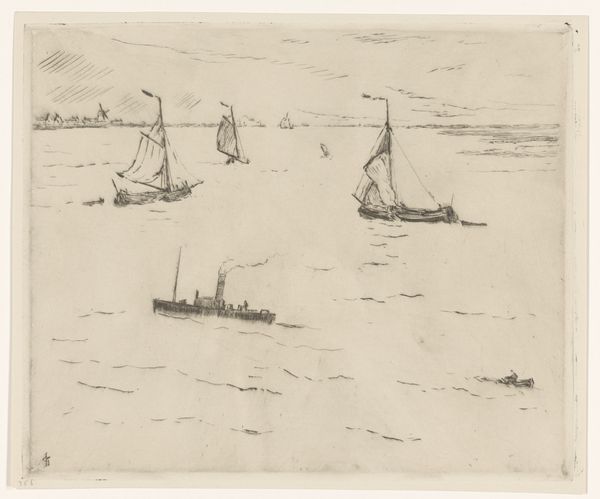
Editor: Here we have Adolf le Comte's "Schepen op het water," which roughly translates to "Ships on the Water." It’s a drawing made with pen and ink on paper, dating somewhere between 1860 and 1921. The loose sketching style makes it feel breezy and almost unfinished, which is appealing. What elements of the composition stand out to you? Curator: The initial focus invariably turns to the clustering of the vessels. Note the repetition of form. How does the convergence of masts and sails structure the composition? Does the artist prioritize capturing a likeness of each individual boat, or is there a larger semiotic meaning being generated through their assembly? Editor: I see the repetition creating a sort of visual rhythm. It does seem like the details of each boat are less important than the overall impression of a busy harbor, maybe. What does the technique tell us? Curator: The artist's choice of medium — pen and ink — produces a marked linearity. Observe how each stroke builds form, a constant paring-down of detail. The restricted color palette further serves to accentuate the lines; this etching presents a scene divorced from easy categorization. How would you assess the overall effect of these choices, and what is it communicating about form versus subject? Editor: So it’s less about what’s depicted and more about how it’s depicted. The simplicity highlights the formal relationships over any specific narrative about seafaring life. Curator: Precisely. Now, consider how we can apply structuralist theory to the image to examine underlying patterns that reflect larger structures of language. Does it succeed in conveying such a semiotic exchange, in your estimation? Editor: It definitely gives me a fresh way to think about how artists make choices to emphasize certain ideas over others. I appreciate that the simple media used can reveal more abstract properties, which might be missed otherwise.
Comments
No comments
Be the first to comment and join the conversation on the ultimate creative platform.
More like this