Copyright: Nicholas Krushenick,Fair Use
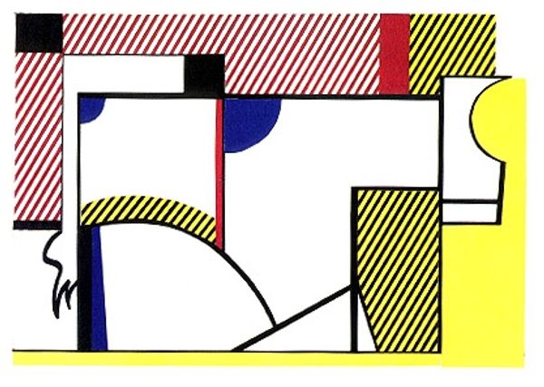
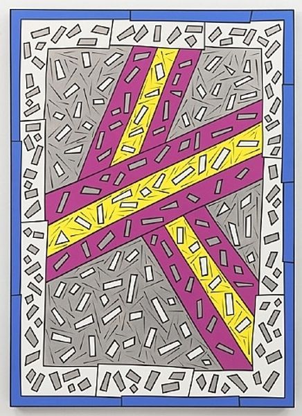
Nicholas Krushenick made this 'Pumpkin' with bold colours and hard lines, which gives me the feeling that he's not trying to trick us into seeing depth, but rather inviting us to get lost in the process. The high-key colours he's chosen are quite flat, but the diagonal marks in yellow that surround the blue shapes give the painting a real sense of movement. The paint looks as though it's been applied in one even layer, there are no brush marks to show the artist's hand. My eye is drawn to the centre of the piece where the white shapes create a kind of optical illusion. Krushenick's bold choices make me think of someone like Ellsworth Kelly, but Kelly's colours are more meditative, whereas Krushenick's palette brings more of a sense of humour and graphic punch! Art is like an ongoing conversation, don't you think?
Comments
No comments
Be the first to comment and join the conversation on the ultimate creative platform.
More like this