painting, acrylic-paint
#
tree
#
painting
#
landscape
#
acrylic-paint
#
forest
#
realism
Copyright: Eyvind Earle,Fair Use
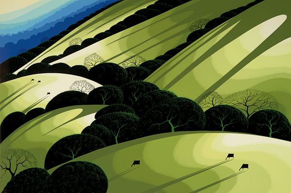
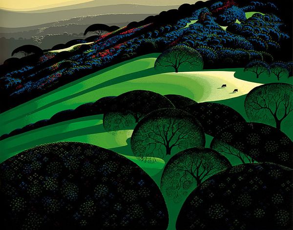
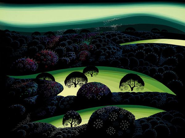
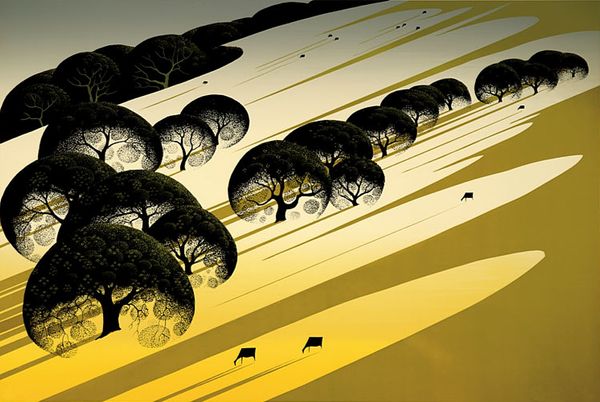
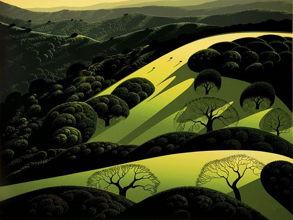
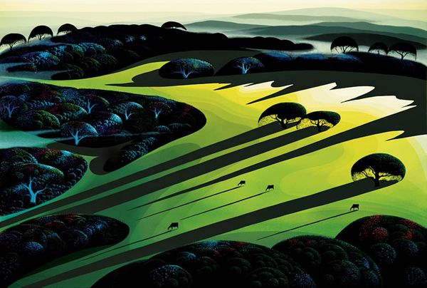
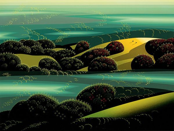
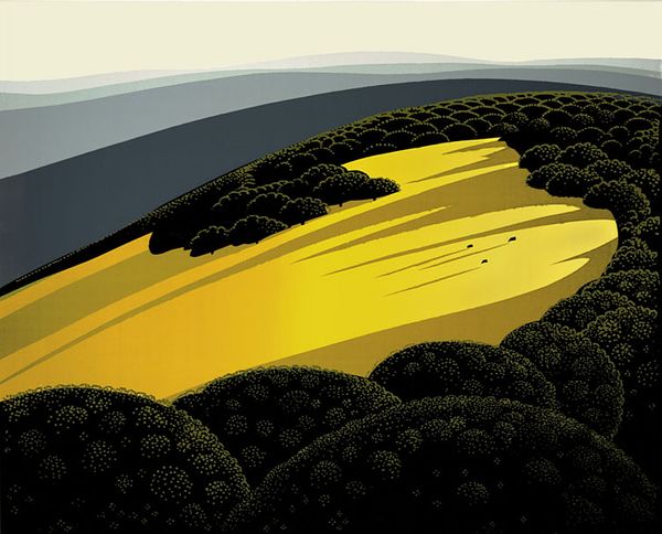
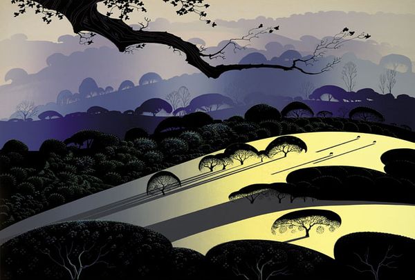
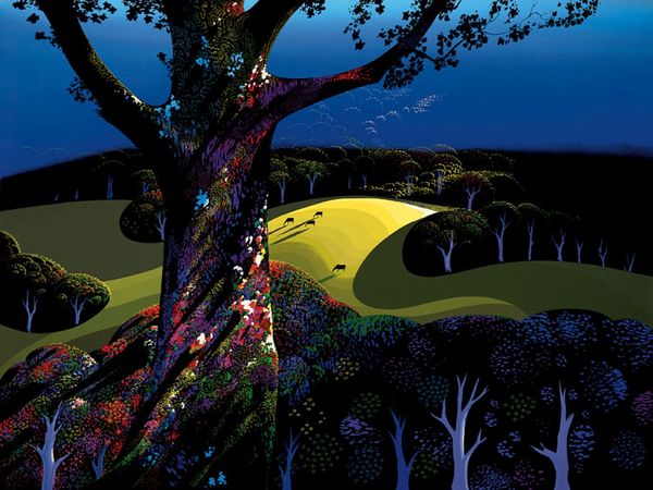
Eyvind Earle made this landscape painting sometime in the 20th century, and it's a trip! It’s all about these flat, bold colors and shapes bumping up against each other. It’s so stylized, right? You can tell he’s thinking a lot about how the picture is built, not just what it shows. Look at those trees! They're like perfect dark green lollipops. Then there's that yellow path snaking through. Everything feels so deliberate, so constructed. It’s like he’s saying, "Hey, look at how I'm making this world." I love how the paint looks smooth, almost like it's printed, but you know it's not. This kind of flattening makes you focus on the shapes and the way they fit together. See how the shadows of the trees on the hill act like arrows, guiding you through the landscape? The tiny cows add a touch of humor. Earle did a lot of these super graphic landscapes. It reminds me a bit of Milton Avery, in the way he simplifies everything to its essence. Art is just one big conversation, isn't it? Nothing is ever truly finished, and nothing ever has just one single meaning.
Comments
No comments
Be the first to comment and join the conversation on the ultimate creative platform.
More like this