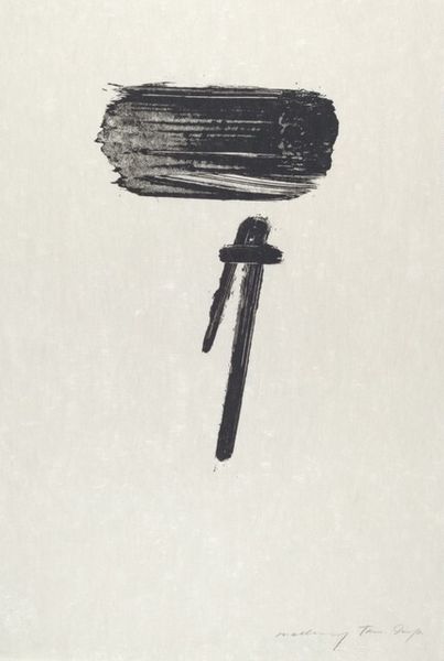
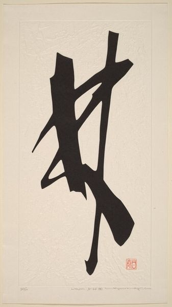
print, linocut
#
minimalism
# print
#
linocut
#
linocut print
#
geometric
#
abstraction
#
modernism
#
monochrome
Dimensions: height 644 mm, width 482 mm
Copyright: Rijks Museum: Open Domain
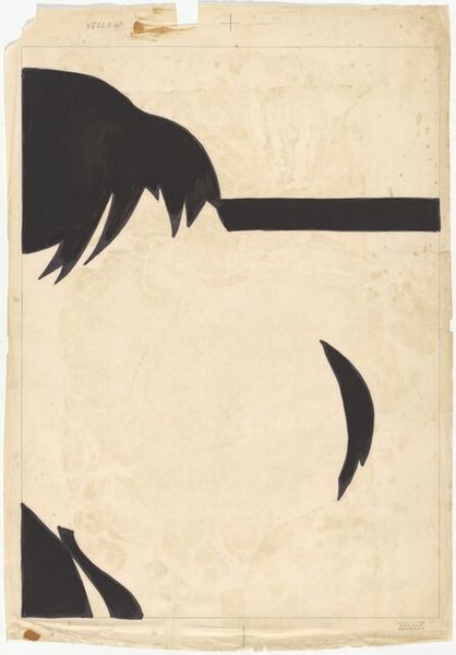
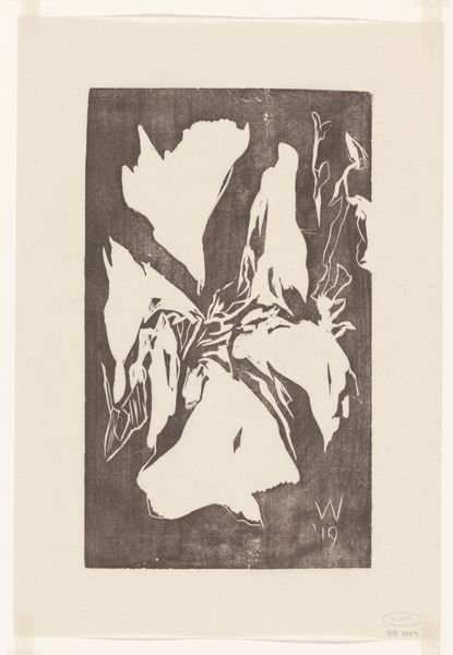
Curator: Well, hello! We're standing before Dirck Nab's linocut print from 2005, entitled "Twee spijkers"—that's "Two Nails" in English. Editor: Two nails...stark. Really raw feeling, isn’t it? The crude, almost violent, carving… and it's so minimal. Just those shapes on the page. Bleak, but also somehow powerful. Curator: Powerful is a great word for it. Linocut is inherently graphic, a bold medium—the areas you carve away stay white, so it’s about reduction, choosing what *not* to show. Think about that symbolically. What are we leaving behind when we hammer something into place? What is concealed or destroyed? Editor: Exactly! Nails have such loaded symbolism, don't they? Crucifixion imagery is the obvious first thought, sacrifice, suffering…but then, also construction, building, holding things together. Are we looking at the instruments of destruction or creation? Nab sets up such a duality. Curator: Nab plays on that tension beautifully, and this isn't a photorealistic rendering. These nails are abstracted, monumental, almost totemic. The larger nail especially feels imposing, maybe a phallic symbol too. It brings an almost brutal masculinity into the composition. Editor: And that smaller one, so lonely next to it... is it a child? Or maybe the aftermath – the legacy of the big nail's actions. What's fascinating, though, is that by stripping the image down to almost nothing, it amplifies those subconscious associations. He’s really digging into the cultural memory. Curator: It’s interesting you call it "digging". This is printmaking, remember? Nab has physically dug these images *out* of the linoleum. To unearth those meanings, and present them to us like some unearthed artifact. Editor: You're right, the process really feeds into the meaning. And the monochromatic palette further emphasizes the bare bones essence. Curator: I think the real punch comes from this almost child-like rendering paired with these quite weighty associations. I suppose that push-pull between formal simplicity and evocative meaning makes this image stick. Editor: Indeed, those nails, even reduced like this, they still hammer home some fairly complicated points! Thanks for nailing it, Dirck!
Comments
No comments
Be the first to comment and join the conversation on the ultimate creative platform.
More like this