Dimensions: plate: 42.5 x 34.4 cm (16 3/4 x 13 9/16 in.) sheet: 52.6 x 45.7 cm (20 11/16 x 18 in.)
Copyright: National Gallery of Art: CC0 1.0
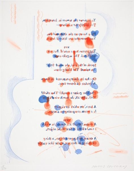
Editor: This is "The Blue Guitar," a print by David Hockney created between 1976 and 1977. I notice the colours and simple composition. What stands out to you about the visual components of this work? Curator: Its structural clarity is quite remarkable. Notice how the frame mimics the guitar strings. The border, like a carefully considered chord progression, sets the stage. The almost naive simplicity of the guitar form belies a sophisticated understanding of positive and negative space. Do you see how the text functions as part of the composition? Editor: I do. The words aren't just informative; they fill the visual space in a balanced way. I find the colour scheme creates a graphic quality similar to Pop Art. It's intriguing that he used etching. Curator: The linear quality of the etching amplifies the graphic effect. Consider the relationship between the depicted guitar and the title. The title leads our perception, prompting us to 'see' a blue guitar even when the etching renders it primarily white with blue accents. It disrupts expectations of realism, inviting us to analyze how language and image interact. Editor: So, it's almost a deconstruction of how we perceive reality through art? Curator: Precisely. Hockney employs fundamental elements – line, colour, text – to explore the construction of meaning itself. It's not just a picture of a guitar; it's an investigation into how we create images in our minds. What initially seems simplistic reveals itself as profoundly considered. Editor: I didn't appreciate how each of those artistic elements was used to convey layers of meaning. Thank you for pointing those out. Curator: It's in the deliberate orchestration of those layers that we find the real substance. Seeing those layers provides deeper meaning.
Comments
No comments
Be the first to comment and join the conversation on the ultimate creative platform.
More like this