#
washington-colour-school
Copyright: Sam Gilliam,Fair Use
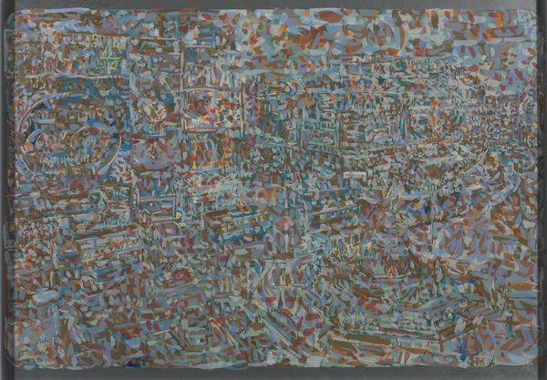
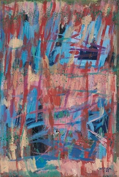
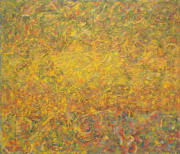
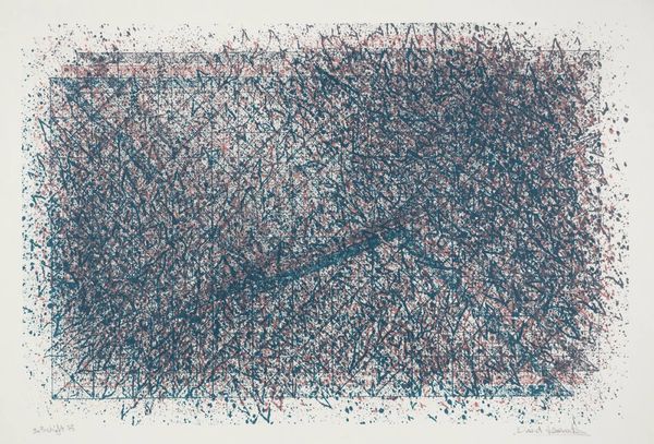
Sam Gilliam created “St. Albans” with what looks like a rainbow of pastels, building color through small marks. You can tell artmaking for Gilliam was definitely a process; he didn’t just slap on some color and call it a day. Look closely, and you'll notice the texture achieved through layers of pastel strokes. The surface almost feels like it’s breathing. The way Gilliam uses color, thin washes over thicker lines, gives a real emotional punch. I am drawn to the lower section, to those furious red marks that seem to anchor the composition while also vibrating with energy. It’s like the whole piece is built from the ground up. Gilliam reminds me a lot of Joan Mitchell, another painter who understood the power of color to convey emotion. But unlike Mitchell, Gilliam brings a structured order to his marks. Ultimately, this artwork is all about possibilities, embracing ambiguity and multiple readings.
Comments
No comments
Be the first to comment and join the conversation on the ultimate creative platform.
More like this