drawing, paper, pencil, graphite, architecture
#
drawing
#
16_19th-century
#
landscape
#
paper
#
german
#
pencil
#
graphite
#
architecture
#
realism
Copyright: Public Domain
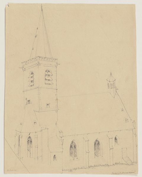
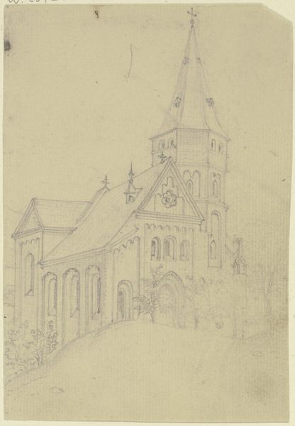
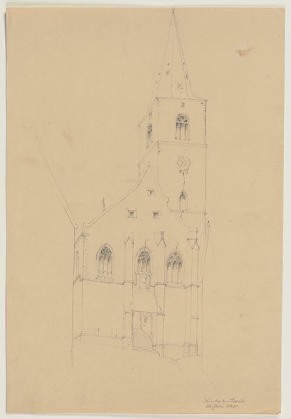
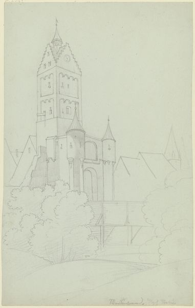
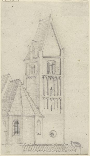
Editor: Here we have Karl Ballenberger’s “Kirche zu Königshofen, vier Stunden von Ansbach,” a pencil and graphite drawing on paper. It feels so precise, almost architectural in its detail. What stands out to you about the formal qualities of this piece? Curator: Notice how the artist meticulously renders each line, prioritizing structure over atmospherics. The emphasis is clearly on the geometrical relationships within the composition. The vertical thrust of the bell tower immediately commands attention. Consider its proportional relationship to the horizontal extension of the church nave; what effect does that asymmetry achieve? Editor: It makes it feel almost…off-balance? Like the tower is asserting itself over the rest of the structure. Is that intentional? Curator: One might say so. The spire directs our vision towards the sky. The detailed facade creates rhythm, further directing our vision. Observe, too, the absence of figures, or truly any environmental context aside from its own geometric being; does this choice inform our interpretation of its subject? Editor: I hadn’t thought of that. By focusing solely on the structure itself, it almost becomes an exercise in pure form, rather than just a representation of a church. Curator: Precisely. One may perceive an artistic statement here based purely upon what’s given in the drawing. Editor: I'm starting to see how the formal elements create a unique presence for the church, beyond just its literal representation. Curator: Indeed. We've examined how line, form, and proportion work together. Perhaps you'll never look at architectural drawings quite the same way again!
Comments
No comments
Be the first to comment and join the conversation on the ultimate creative platform.
More like this