drawing, print, paper, ink, pen
#
portrait
#
drawing
#
script typography
#
hand-lettering
# print
#
hand drawn type
#
hand lettering
#
paper
#
personal sketchbook
#
ink
#
hand-drawn typeface
#
pen-ink sketch
#
pen work
#
sketchbook drawing
#
pen
#
coloring book page
#
calligraphy
Copyright: Rijks Museum: Open Domain
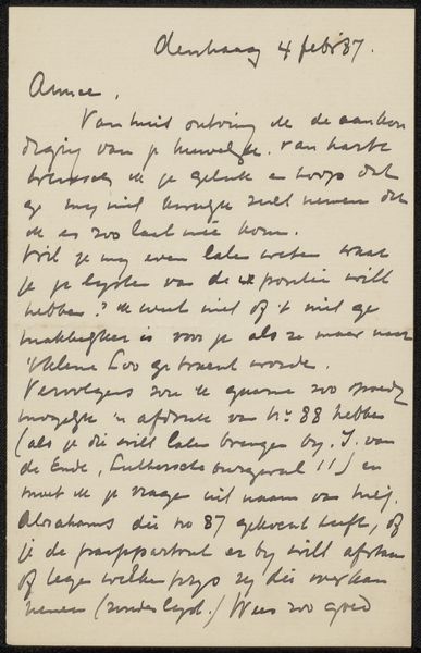
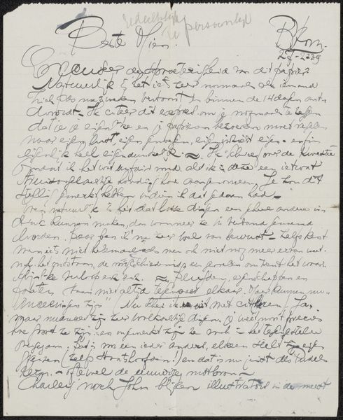
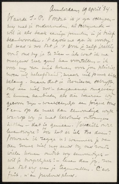
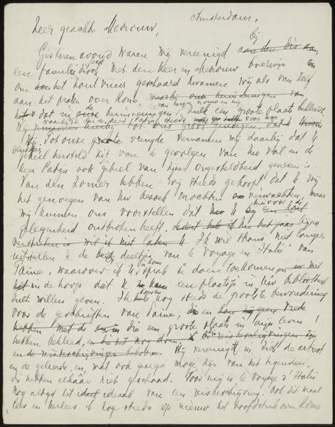
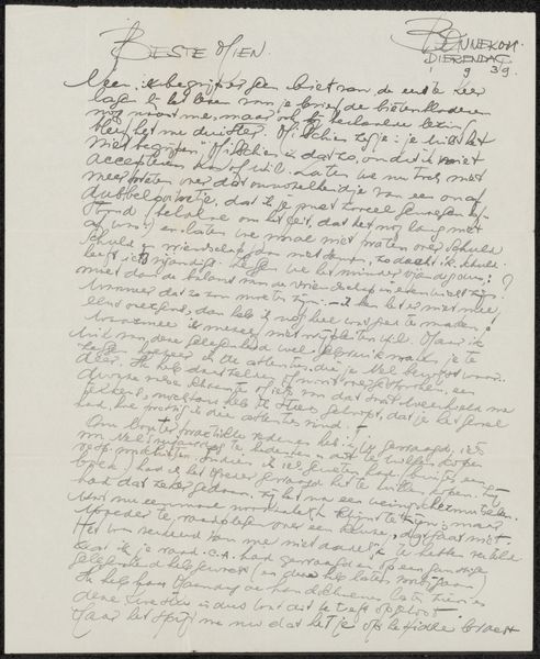
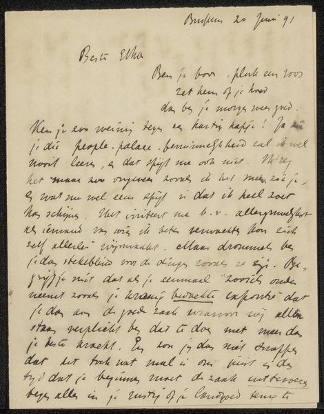
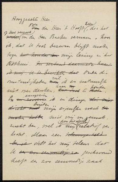
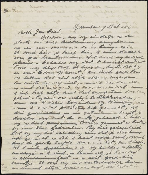
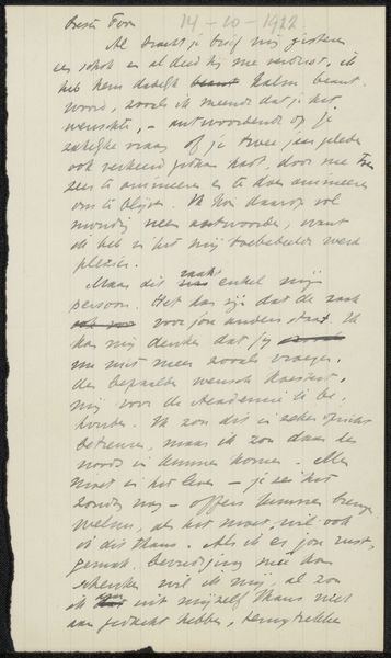
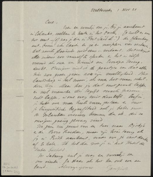
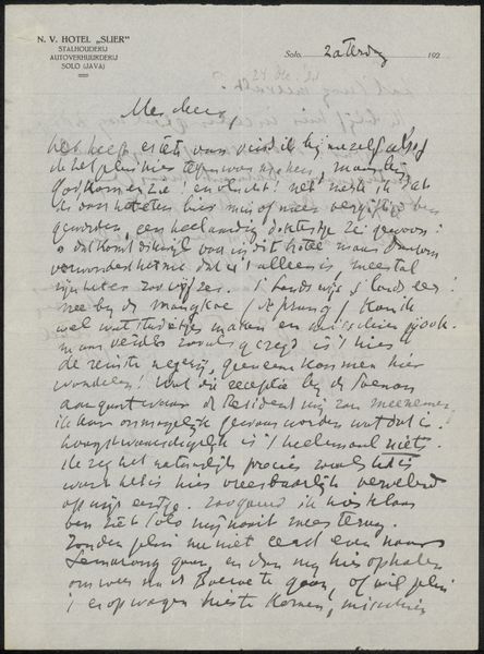
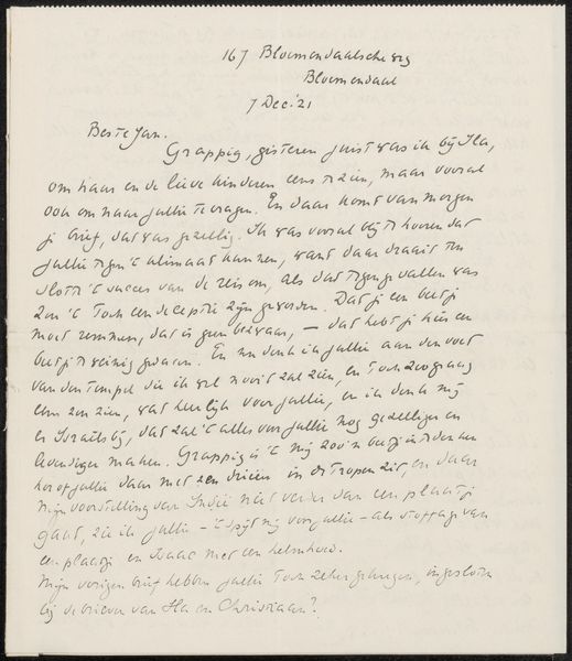
Curator: Here we have "Brief aan Etha Fles," or "Letter to Etha Fles," a drawing from Jan Veth, likely dating to 1899. It is ink on paper. Editor: My immediate reaction is its intimacy, like a captured thought, something both personal and meant to be shared, all woven together. It’s densely packed with meaning, if one could only decipher it fully! Curator: Veth was renowned for his portraiture. What’s fascinating here is the dynamic tension created by the contrast between the controlled script at the top, denoting the Bloomsbury Hotel and the addressee, versus the more organic, flowing hand of the letter itself. It suggests both formality and profound familiarity coexisting. Editor: Yes, there's a deliberate use of contrasting visual language! I see the Bloomsbury heading, acting as a grounding element, almost like an anchor of societal convention against which the unbridled expression within the letter can flourish. Curator: Note the handwriting—the penmanship oscillates between neat cursive and something more rushed, suggesting a mind overflowing with thoughts, struggling to keep pace. It almost embodies the feeling of being present in someone's thought stream. Editor: Symbolically, a handwritten letter possesses an aura absent in digital correspondence. There's time, care, vulnerability invested; here, one senses an urgency—perhaps a confession, or an intimate exchange between Veth and Etha. One sees, too, what looks to be a date at the top right: 1 Maart '99. Curator: Indeed. Look at how Veth uses the texture of the ink itself. The varying line weights and density of the strokes enhance the textural interest and create a certain dynamism—drawing our eye to certain parts, but without directing us, creating a sense of egalitarian exploration across the textual plane. Editor: This image speaks of relationships, memory, the fragile and precious nature of correspondence in an era before instant communication. There's something beautiful in this relic of human connection. Curator: It certainly provides an arresting view into the intersections of communication, aesthetics, and raw emotion through considered deployment of form and script. Editor: A very poignant little document. Thank you for focusing my eyes.
Comments
No comments
Be the first to comment and join the conversation on the ultimate creative platform.
