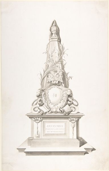
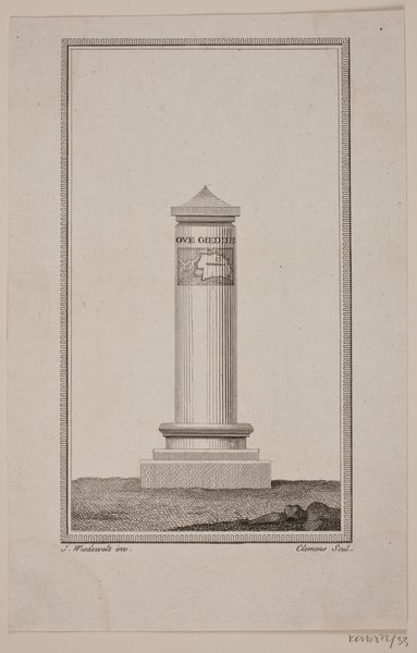
Monument ter nagedachtenis aan de schilder J.C. Schotel, 1838 1839 - 1842
0:00
0:00
hendrikuspennock
Rijksmuseum
drawing, ink, pencil
#
drawing
#
neoclacissism
#
old engraving style
#
landscape
#
historical fashion
#
ink
#
geometric
#
pencil
#
academic-art
Dimensions: height 450 mm, width 290 mm
Copyright: Rijks Museum: Open Domain
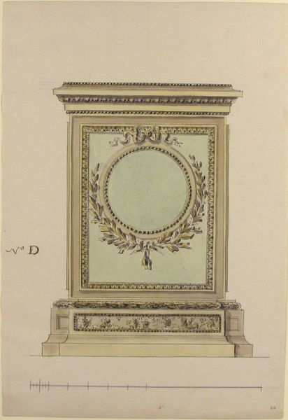
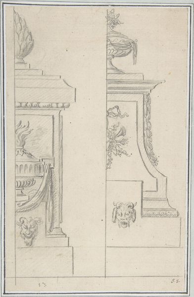
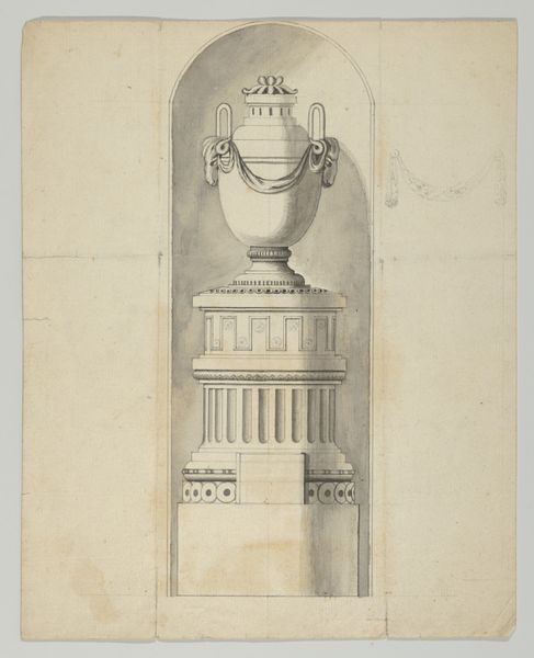
This monument, remembering the painter J.C. Schotel, was designed in 1838 by Hendrikus Pennock using pen and gray ink. Pennock’s choice of ink on paper is itself telling, being a medium of design and not necessarily that of the end product. Consider the context of the time: the 19th century was marked by industrialization and urbanization, radically changing artistic production. Pennock would have been considering not only the artistry of the design, but also the work required for the execution. Look closely at the architrave, frieze, and cornice. Notice how the precise lines create a sense of depth and volume, mimicking the appearance of three-dimensional stonework through skillful shading. This required not just artistic vision, but also drafting skills. The monument's design represents a significant amount of manual labor, from quarrying and carving the stone to its eventual placement. By examining the processes and materials, we can understand the social and cultural values embedded within the artwork, challenging traditional distinctions between fine art, design, and craft.
Comments
No comments
Be the first to comment and join the conversation on the ultimate creative platform.
More like this