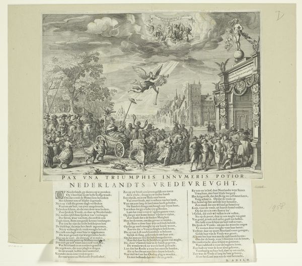
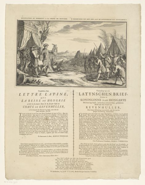
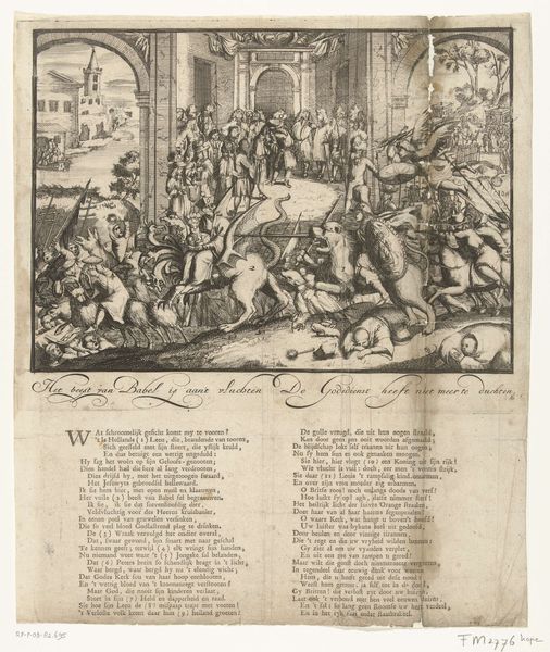
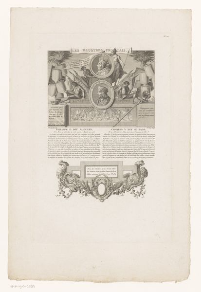
print, engraving
#
narrative-art
#
baroque
# print
#
history-painting
#
engraving
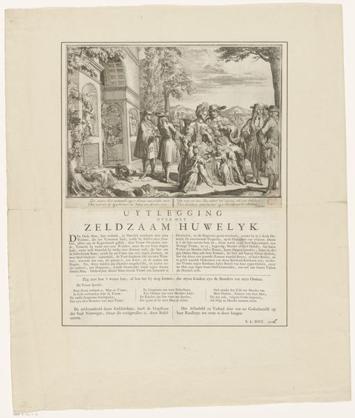
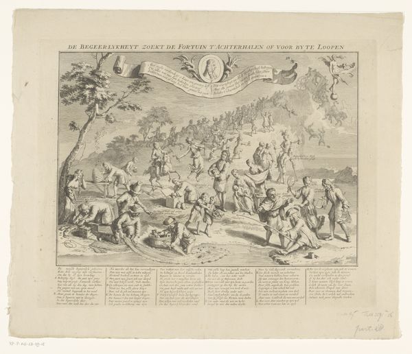
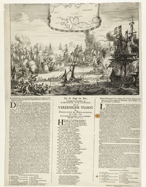
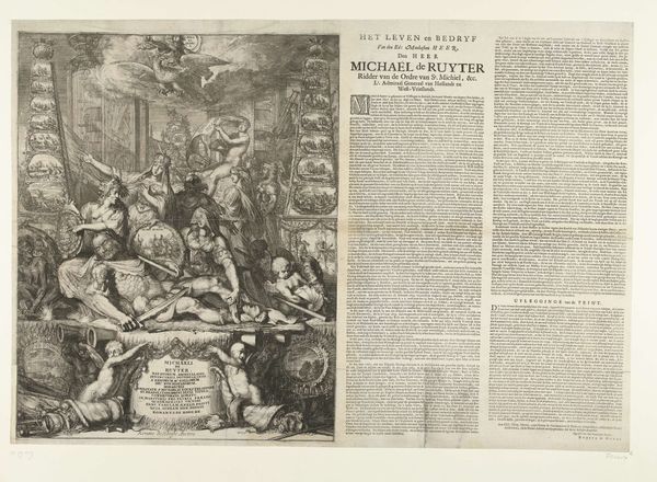
Dimensions: height 522 mm, width 403 mm, height 307 mm, width 403 mm, height 215 mm, width 382 mm
Copyright: Rijks Museum: Open Domain
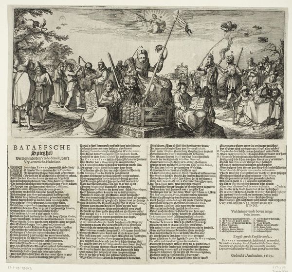
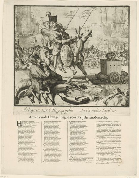
Editor: This print, "Franse wreedheden in Bodegraven en Zwammerdam, 1672," by Romeyn de Hooghe, is a stark depiction of violence. The density of figures and the burning buildings create a really chaotic atmosphere. How do you even begin to interpret something this intense? Curator: Intense is right! It’s almost like stepping into a nightmare, isn't it? Look at the way de Hooghe uses the print medium - all those incredibly fine lines, layering detail upon detail to amplify the horror. The 'narrative art' style and 'history painting' tag hint at a broader story. What does "Baroque" mean to you when you see an image like this? Editor: Baroque makes me think of drama, but often grandeur… not usually scenes of such explicit cruelty. Curator: Exactly! That tension is key. De Hooghe is deliberately twisting the Baroque aesthetic. This isn’t celebrating power; it’s condemning abuse. This engraving was made in 1673. What do you think its purpose was? Editor: To show the cruelty of the French? It almost feels like propaganda. Curator: Precisely! It's raw, unfiltered, and meant to stir up very specific feelings in the viewer. Can you see how the artist guides the viewer to empathize with the victims rather than the victors? Look at how bodies are strewn about! Editor: It’s definitely effective. I'd never considered how prints could be used this way, almost like early news reports, but far more emotionally charged. It gives you a very different perspective on the Baroque style and the role of art. Curator: Isn’t it fascinating? Art can be both a reflection and a weapon. Understanding that complexity is why I find art so continually rewarding.
Comments
No comments
Be the first to comment and join the conversation on the ultimate creative platform.
More like this